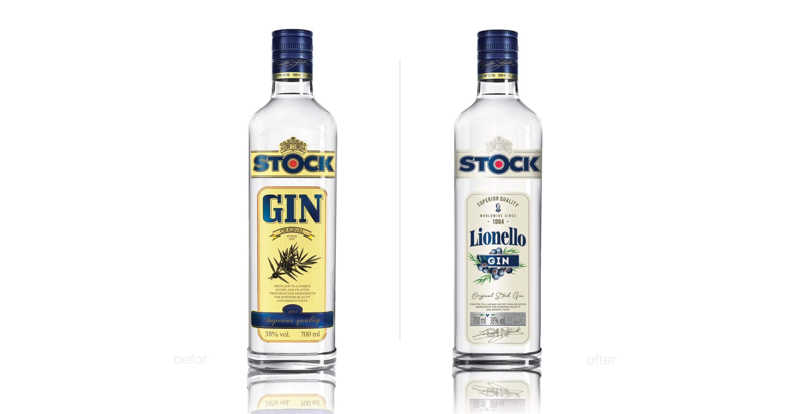
The Stock Gin brand, which originated in the Stock family, required a redefinition of its key quality strengths. At the same time, the unique history of the liquor had to be adequately conveyed. Therefore, an important aspect of the project was to convey the brand’s values, its key benefits but also to convey the positioning through new branding and packaging design. This was precisely the challenge we faced in PND Futura Branding Agency. The topic is even more interesting because it was linked to the interesting story of the brand’s founder and gin creator- Lionell Stock. The new, elegant packaging design we created gave the brand originality. It also emphasized its positioning based on the prestige, worldliness and quality of the drink.
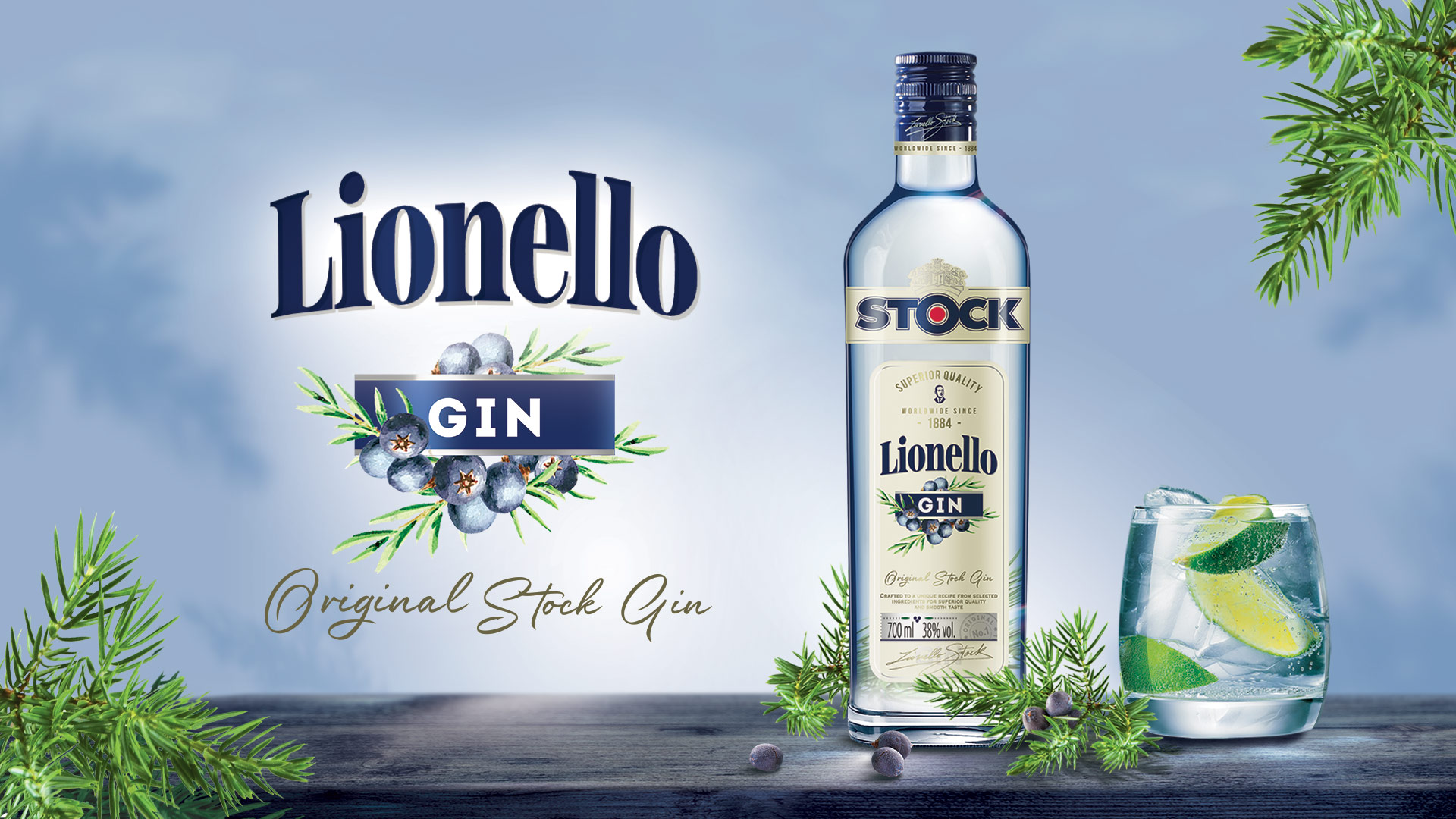
By redesigning Lionello Gin’s packaging, the new label evokes associations with luxury and elegant brand. Diverting from the previous colour scheme allowed us to position new Lionello Gin closer to Stock Prestige. At the same time, we highlighted the elements that prove it belongs more to the gin category.
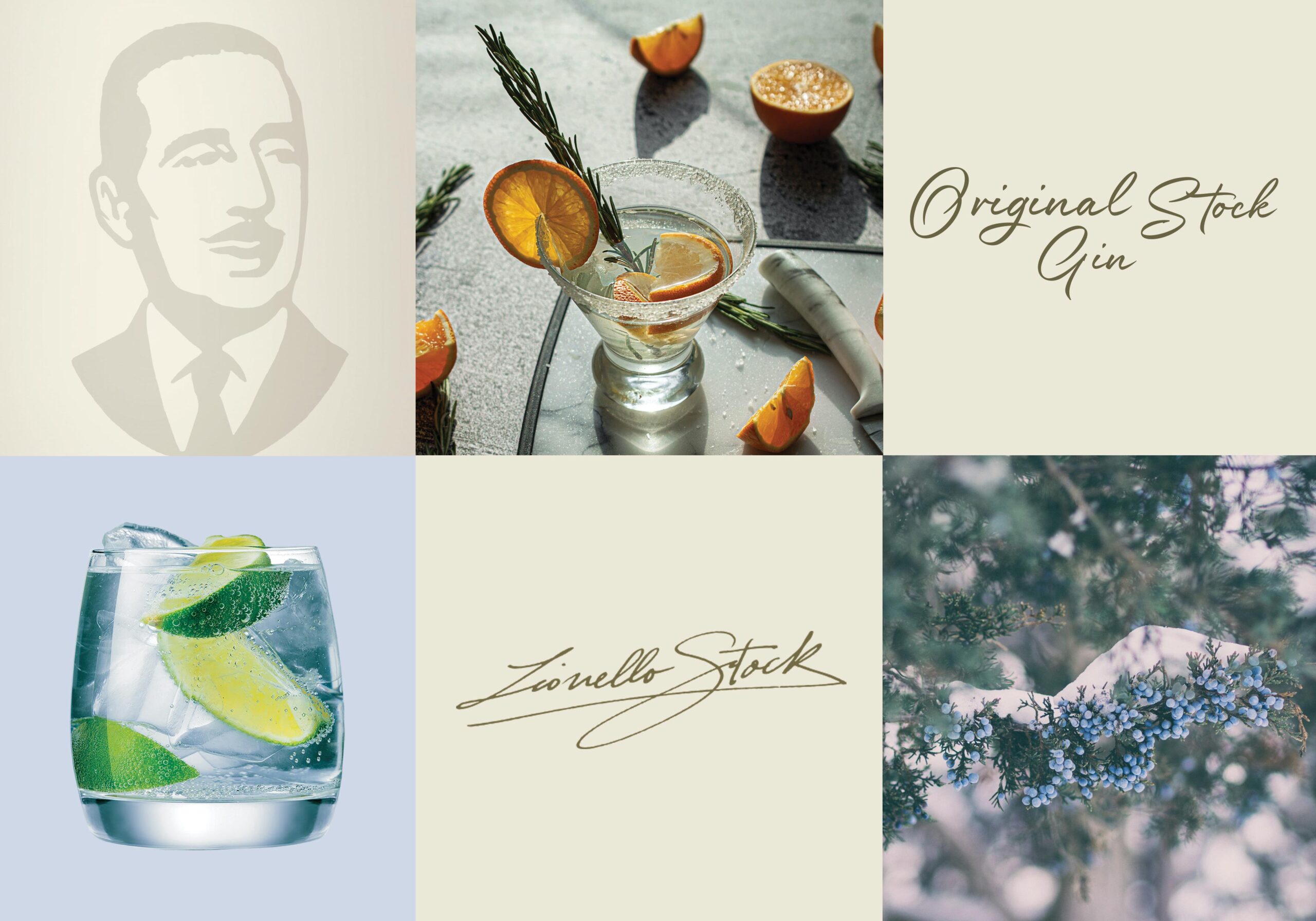
Lionello GIN, through a designed logotype, typography and refined graphic elements, can successfully function and stand out in the competitive and increasingly popular gin category. At the center of the new label is a carefully crafted illustration depicting a natural-looking branch with juniper fruit. It conveys the product’s main benefits – flavour and fruitiness. With the new name and revised logotype, the brand gained a distinct personality, highlighted by Lionello Stock’s illustration, typography and clauses, indicating the benefits and reason-to-believe.
Information on alcohol capacity and volume took an organized and aesthetically pleasing form on a silver panel. Adding to the premiumness of the product is the signature of the brand’s creator, Lionello Stock. Also, the pearl colour scheme used in the design emphasizes the premium style. The serving suggestion, found on the back label, places the new brand even more firmly in the world of the gin category. It also certifies the pleasurable nature of the drink. The back label includes the history of the drink, which is equally worth knowing, along with an image of the creator. As part of our cooperation, we also prepared a Key Visual project for the new brand – which is the basis for the developed brand communication.