Komputronik is one of the largest chains of stores selling electronic equipment in Poland. The brand has been operating for over 25 years all the time developing its wide offer. It is available in an online store and a network of stationary points.
With the rise of e-commerce and the need for more effective communication in the online space, Komputronik needed a rebranding. The identity at the time was not associated with a brand focused on growth and openness. The stellar logo that had been in place for years, despite its recognizability, was incompatible with the world of modern technology.


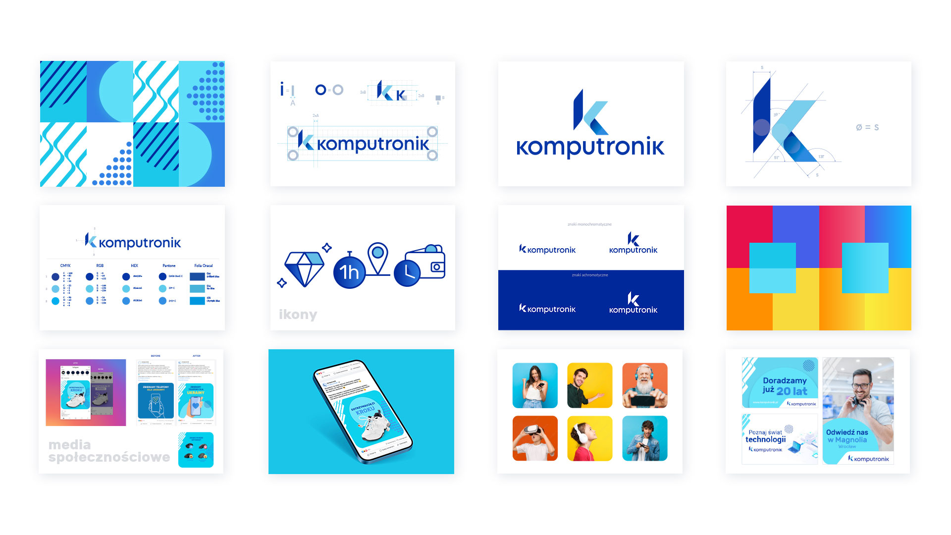
The task given to us included developing a logo and a coherent identification system, reflecting the values of the brand. We designed the whole system to be adaptable in all areas of Komputronik’s functioning.
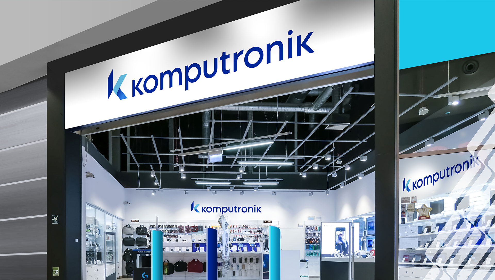
Our goal was also to create an identity that expresses development, openness and competence in the field of new technologies. In addition, it will be aligned with the brand’s activities both in the salon network, website as well ass online store and social media.
Designed by us, the new logo functions with a sigil based on the author’s letter “ K”. Its details and colours express the strength and competence of the brand. In the symbol we wanted to show the values important to Komputronik, such as openness, precision, safety and efficiency.
We chose an original typography for the mark, which, when juxtaposed with the symbol, creates a professional and contemporary brand image. Through the use of shades of blue, we referred to the previous logo, but with a larger colour palette and the introduction of shading, the mark became strong and qualitative. This made the brand more contemporary and following technological innovations.

The identity we proposed is a fresh and an revolutionary step towards building a new brand image. It is now more appealing to an increasingly younger audience using e-commerce shopping, not forgetting middle-aged customers and technologically active seniors.
The new branding has made Komputronik’s image more in line with the industry in which the company operates, without
distancing the audience with cool professionalism. The brand puts a strong emphasis on the human dimension of advertising on technological choices. The identity we prepared also fits in with the style of the gaming category, an extremely important section of the company’s offer. During the design process, we were also guided by the idea of creating a system that would be easily adaptable to the brand’s activities in the offline and online worlds.

The shapes, icons and layouts developed as part of the identity system are responsive, adapted to various formats and online media, with a view to being able to use the identity in a consistent manner, also in stationary stores and outdoor materials. We prepared all the rules for the implementation of individual elements in a dedicated brandbook, which was created in close cooperation with the client. This material includes, among other things, a description of the logo
and its variants, defined colours and typography but also a described brand world with examples of its creation.
The distinctive elements of the identity system derive from the design of the mark and are adapted to different design needs. They take into account the requirements generated by the brand’s presence in social media and the modern communication needs that brands have. Komputronik’s new branding advises and offers helpful technology in everyday life and we helped it do it!