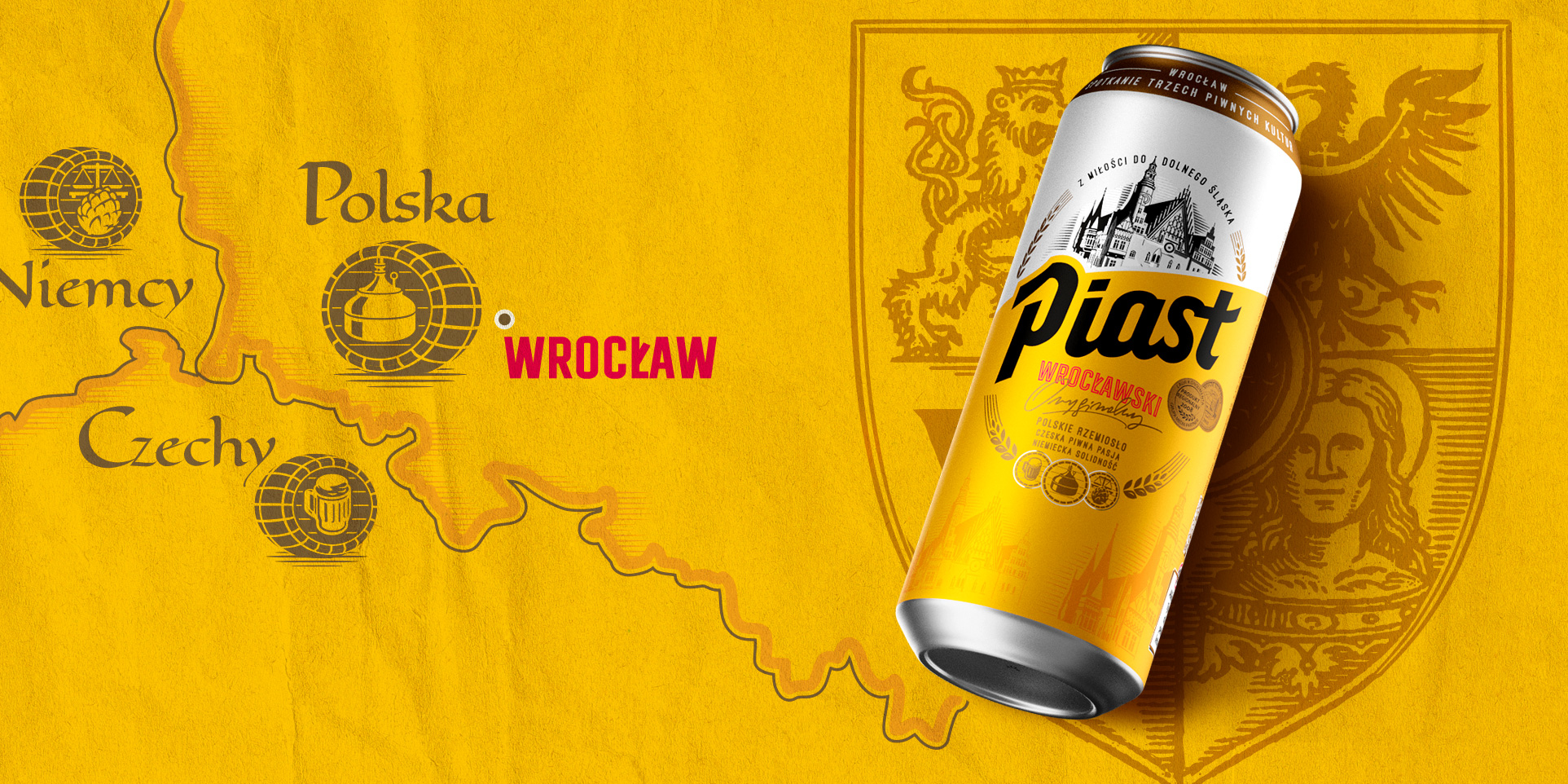
Piast is a brewing symbol and history of Lower Silesia and its capital – Wrocław. Redefining the branding of such a brand along with the development of packaging design was the task of the tender organized by Carlsberg Poland, which we, as a Wrocław agency, particularly wanted to undertake.
At the beginning of our work, we thoroughly analyzed the design assumptions and brand problems. We also got acquainted with its history and regional connections to find valuable inspiration for the concepts. We drew from the past of Piast, as well as the culture, symbolism and brewing of Lower Silesia. With this knowledge, we prepared creative assumptions and design lines for changes in the image and packaging of the Piast brand. Effect? Podium and first place. Great joy and toasts with golden liquor.
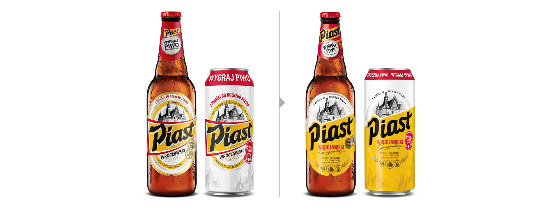
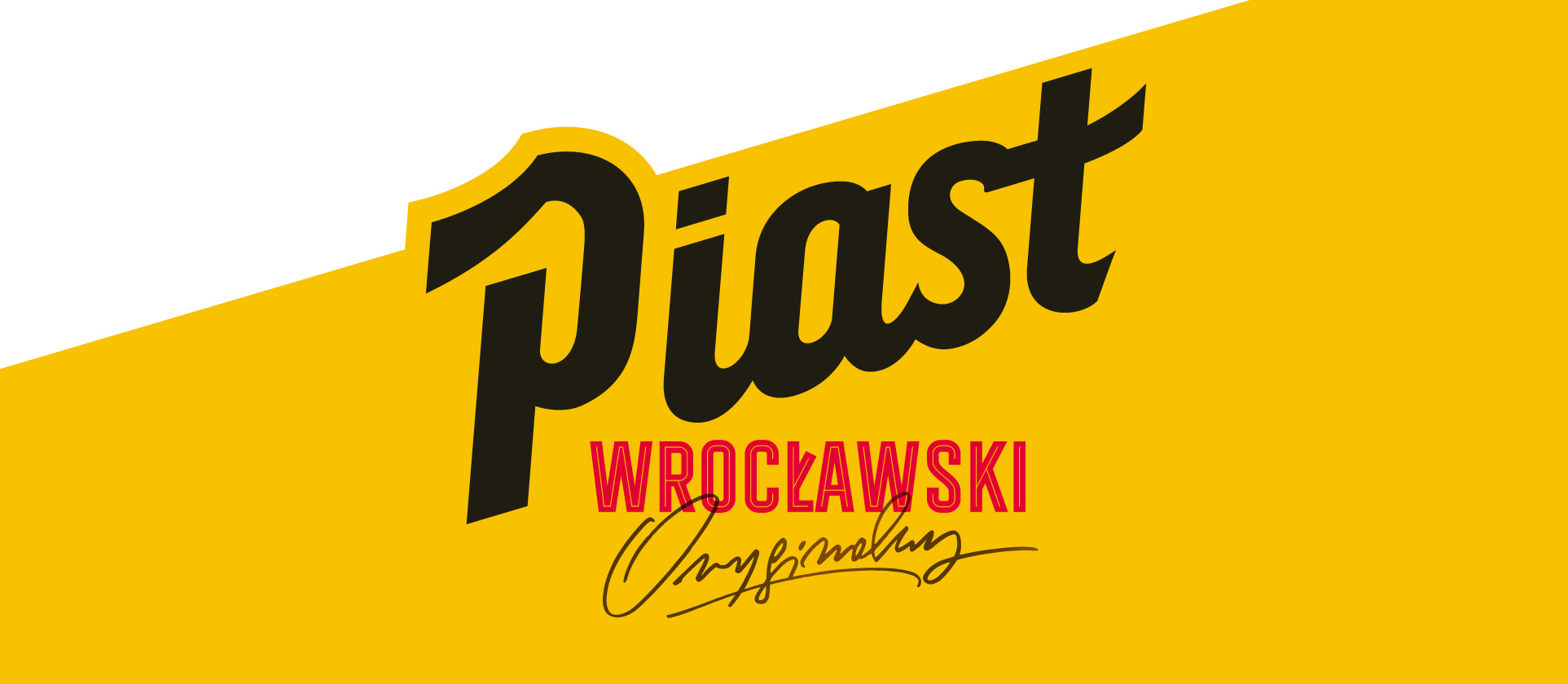
The brand design created by the new image and packaging refers to the roots of brewing in the Lower Silesia region and the experience of the Czech, German and Polish times. The key elements that build the brand’s identity are colors and the characteristic black logo. The new version of Piast gained a distinct, contemporary character. As part of cooperation with the client, we have developed a new,
inspired by historical typography, the Piast logo. We have redefined the colors of the brand, which together with a retail illustration of the Wrocław City Hall, which more proudly reflects the brand’s values.
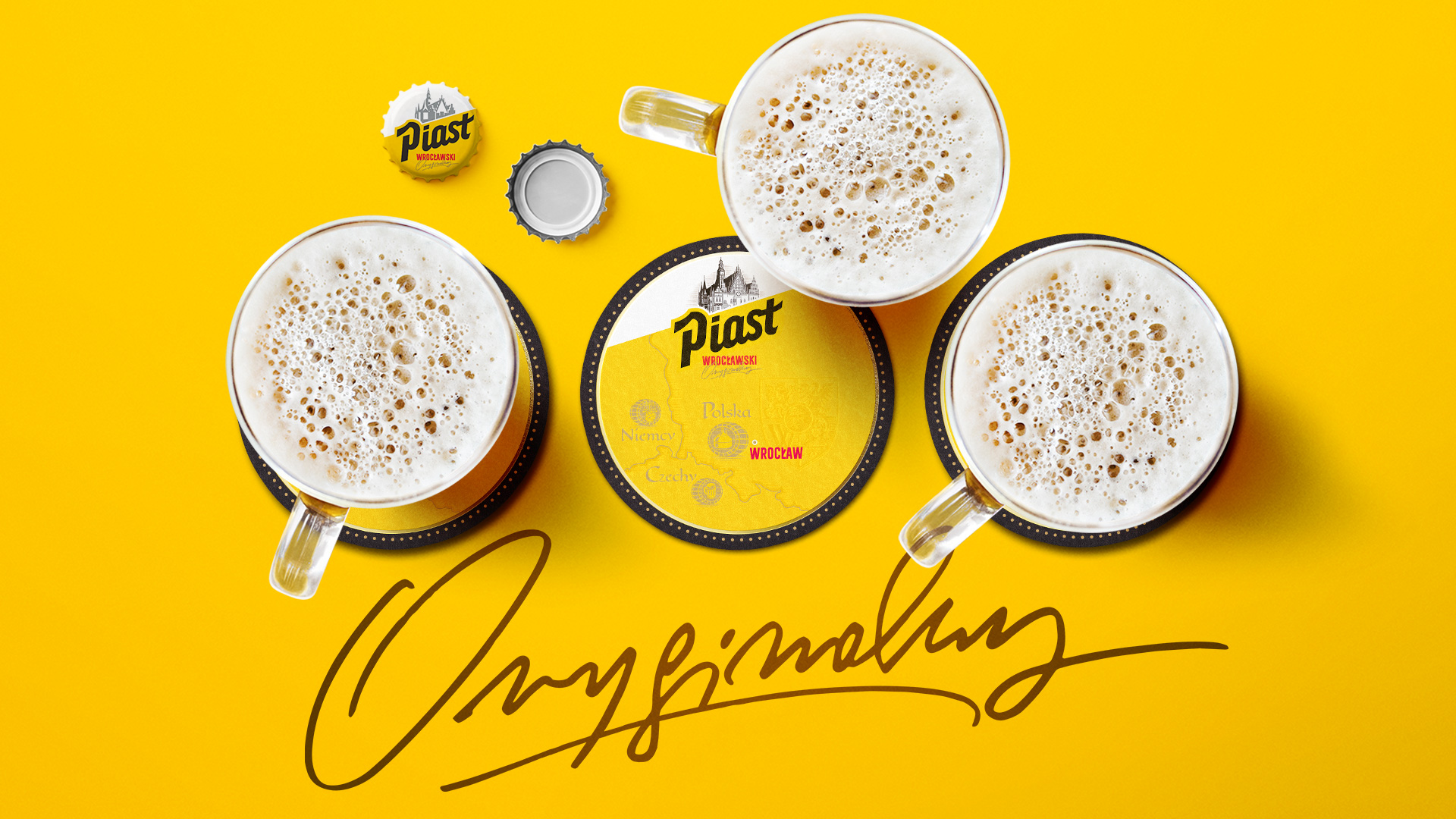
In addition to new packaging, in a regular and promotional version, we have prepared KV brands, POS materials and lottery communication – Win a Beer, as well as a comprehensive brand book of the brand.