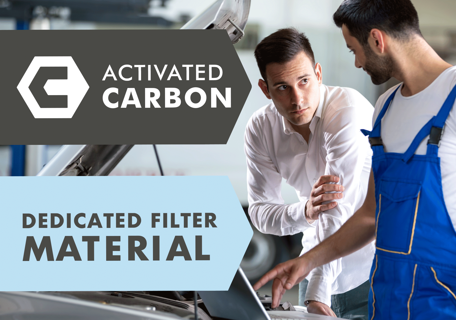
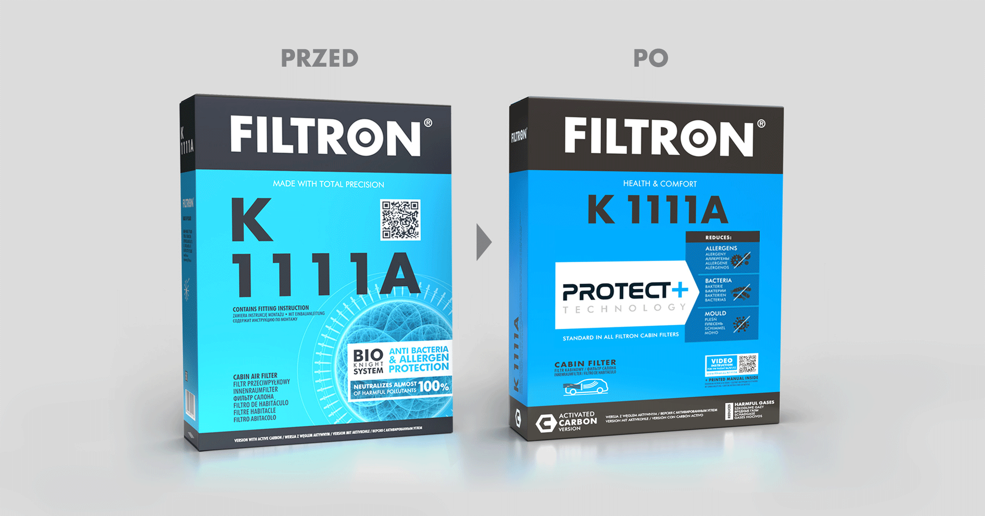
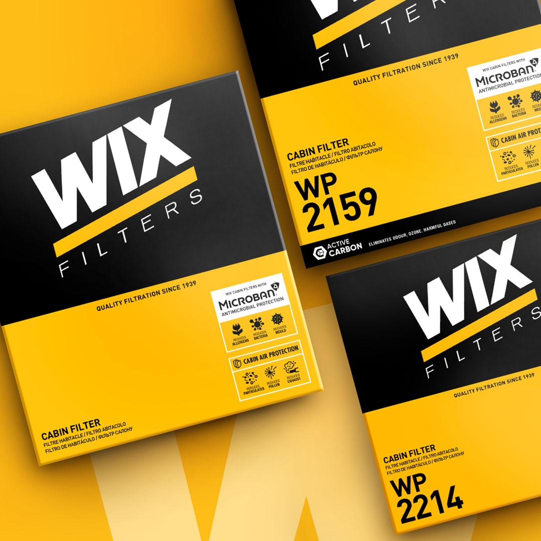
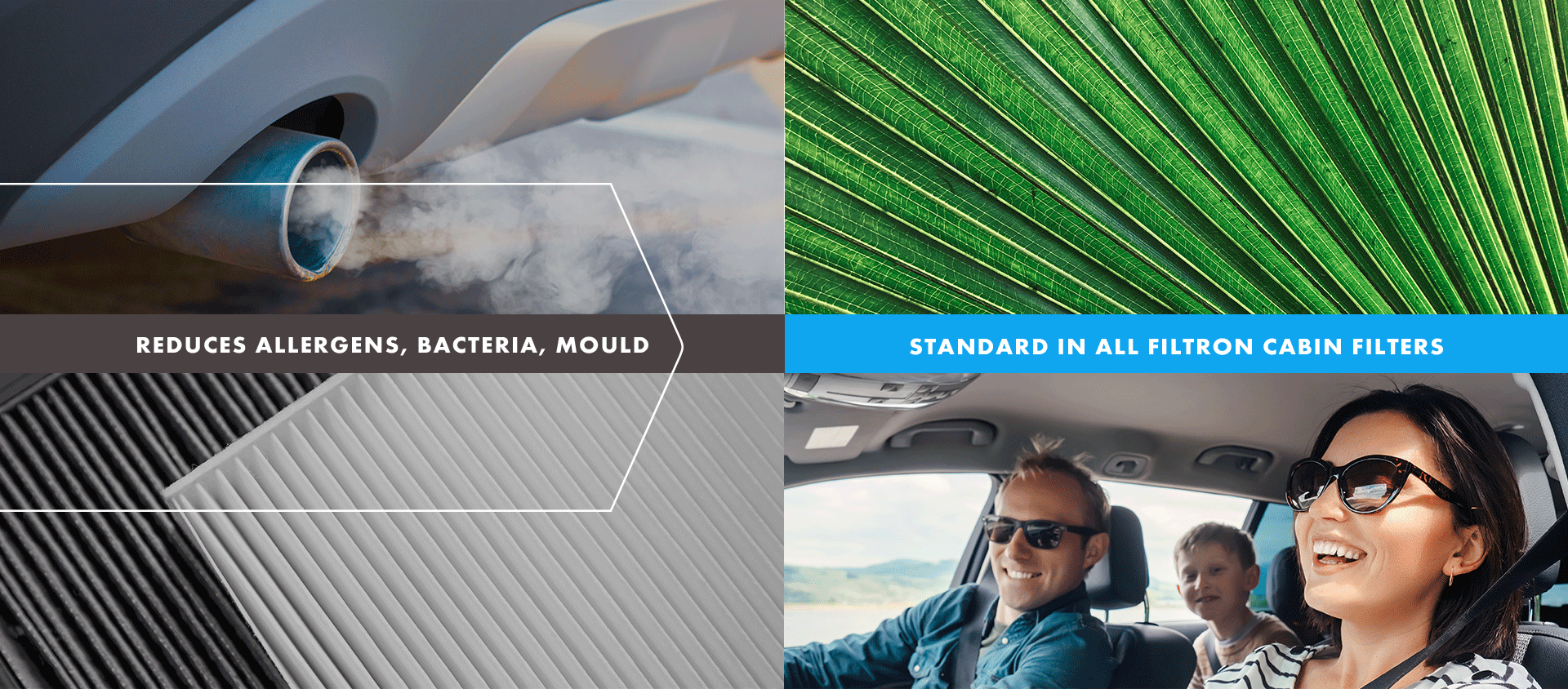
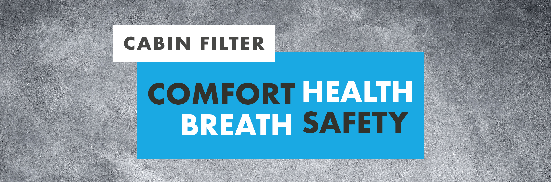
Filtron is a brand with a presence in the markets of Europe, Asia and Africa, part of the Mann+Hummel multinational, which offers car filters, including cabin filters. The brand’s pillars are reliability, convenience and ease, as well as protection and health. The new positioning of the brand was presented in the packaging design – the redesign of the cabin filters packaging was to comprehensively respond to the brand’s strategic objectives. First of all, it was necessary to better communicate the presence and performance of antimicrobial protection, which comes as standard in Filtron brand products. An equally important task was to introduce and organize all the necessary information that ensures users of the product – mechanics – comfortable and smooth work with the product. How to convert such defined goals into creative-design solutions?
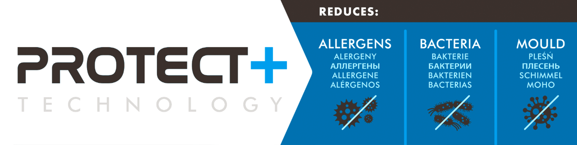
In the area of creation, we dealt primarily with naming. The idea was to find such a name for the antimicrobial protection system used in the products that would not only be understandable and precise, but also become an expression of “added value”, unambiguously directing the recipient’s attention to the rational and emotional benefits associated with the product. The second area of search was to design branding and a comprehensive graphic language that would optimally achieve the communication goals defined for the
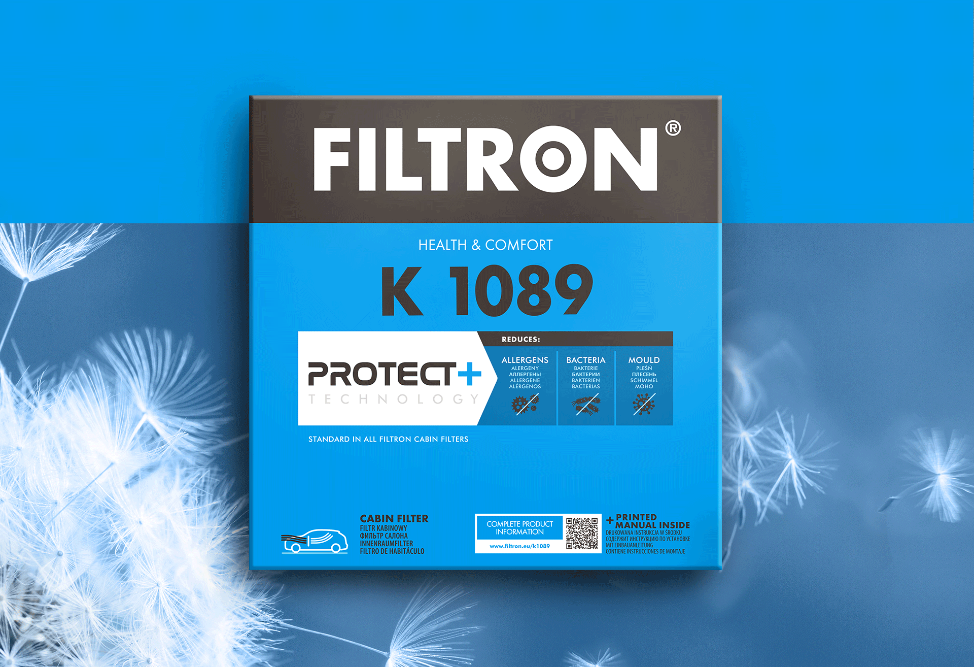
project. In cooperation with the client’s team, the name Protect+ was developed, replacing the ambiguous and difficult to pronounce BIOknight. The center of the new identity is a panel with the system’s logotype, whose modern character, thanks to typography, emphasizes the function and features of the product itself. This element is complemented by an infographic communicating the scope of protection. Subsequent graphic elements follow the adopted style – icons, shapes, typography and colors create a coherent whole, resulting in a strong, recognizable branding.
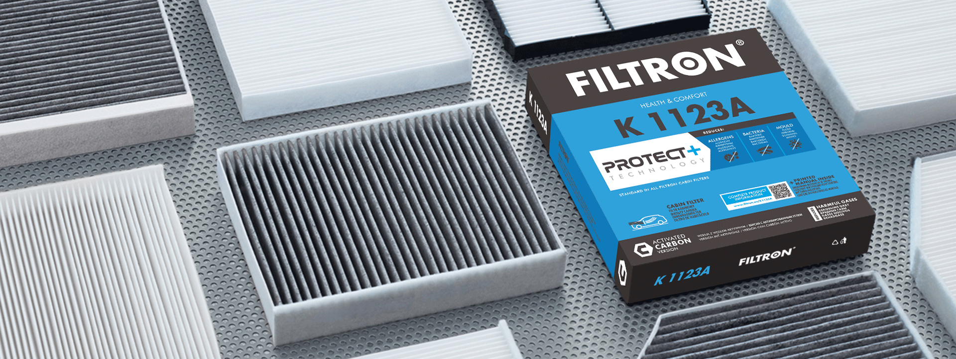
The challenge of the project was to develop a systemic packaging design that can be easily transferred to a wide variety of packaging formats, without loss of identification and strength of the message, as well as readability and communicability of the content on the packaging. The proposed solution based on modules, so that branding in a similar way “works” on each type of packaging, optimally
responded to such a task. Packaging with different formats and proportions (7 groups of packaging, almost 300 die-cut) are consistent and legible.
In terms of implementing the designs and preparing the packaging for printing, the agency realized nearly half a thousand artworks. In addition, PND Futura also developed a clear icon system for the WIX brand.