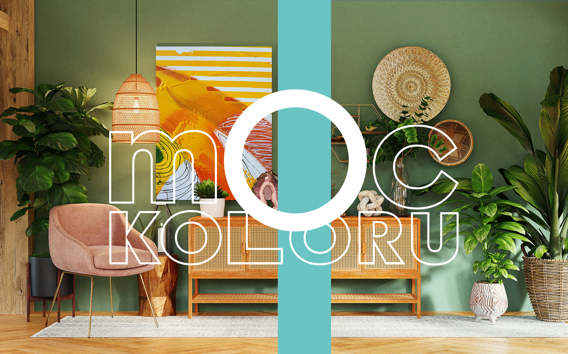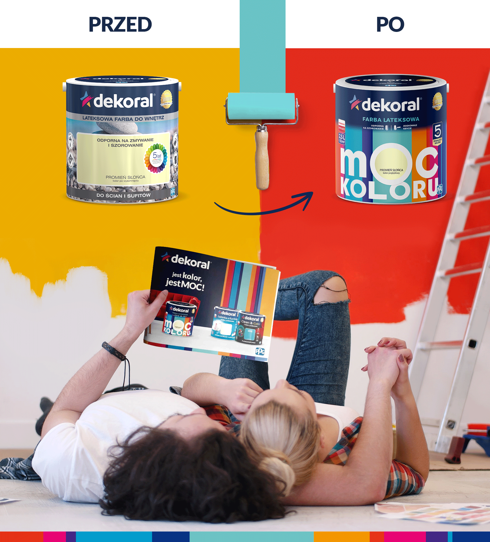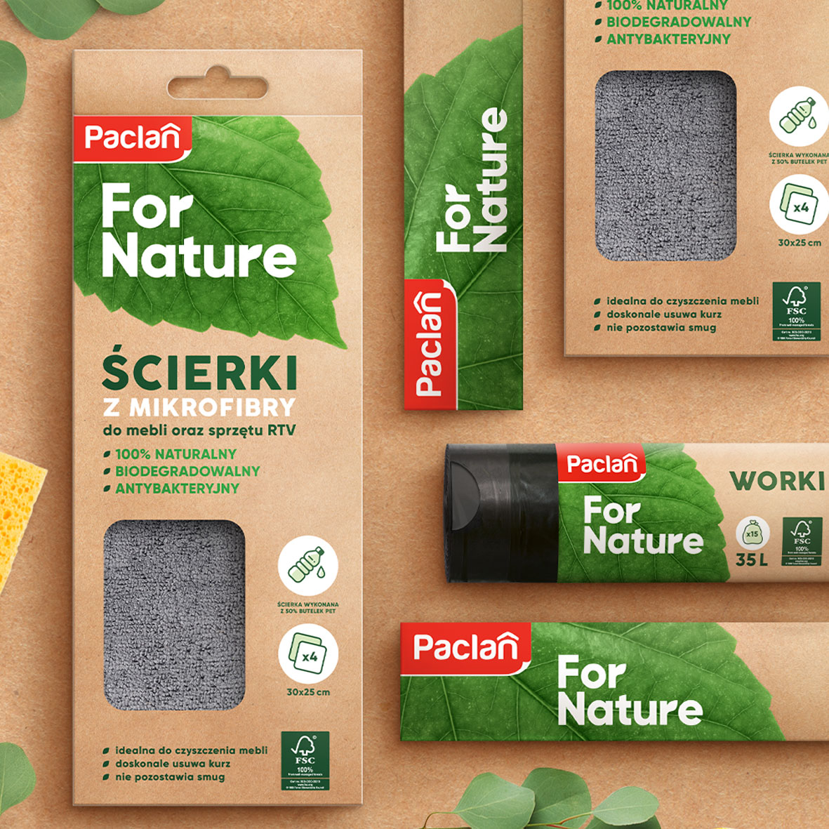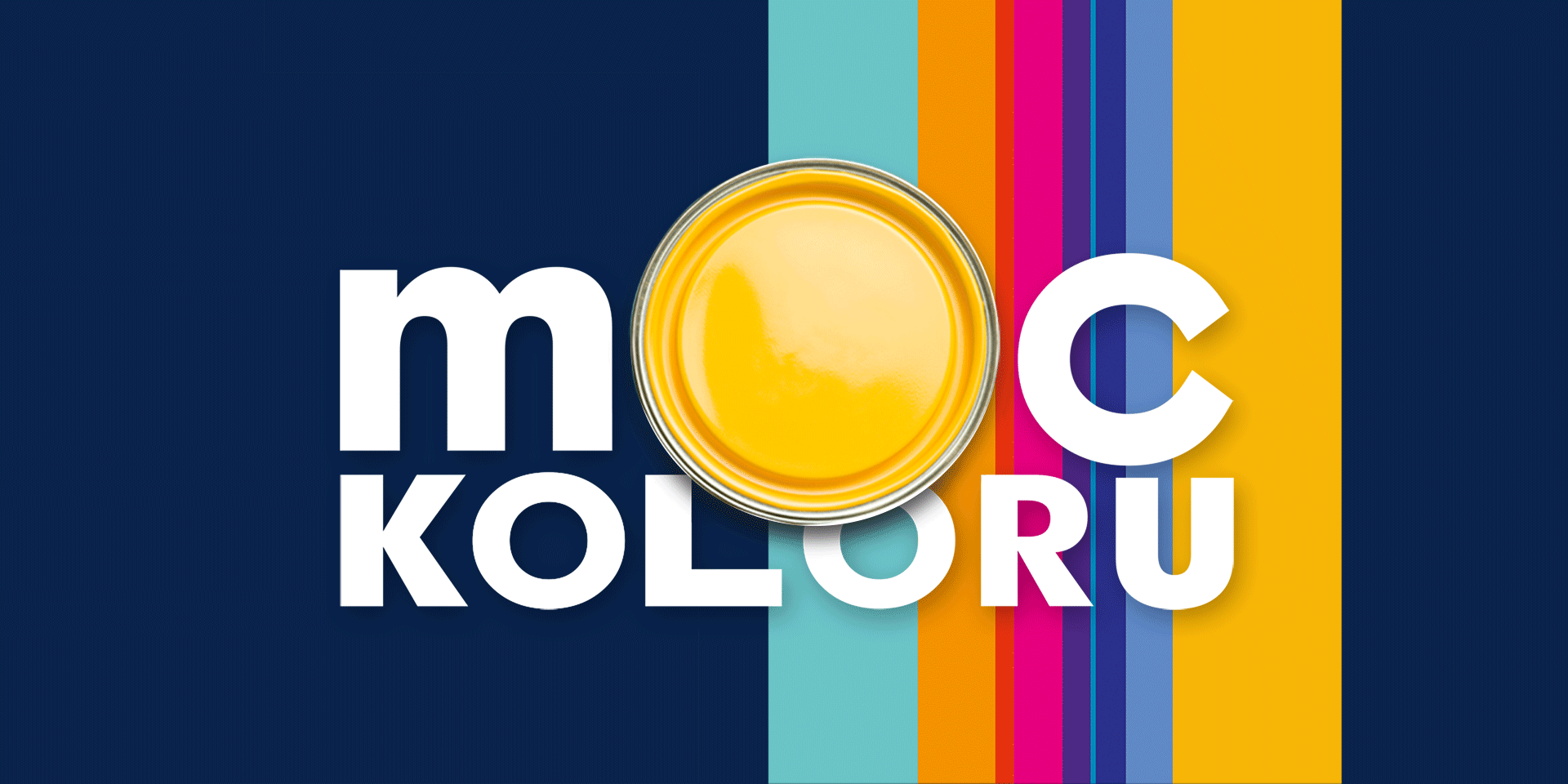
Colours have power: they help to relax, express emotions and stimulate creativity. And it was precisely creativity that we were in dire need of in order to design the new packaging design of Dekoral, another strong brand in the construction chemicals industry, with which we were pleased to collaborate. For more than two decades, this well-known brand has combined experience with the ability to accurately respond to changing market trends and customer needs. All this to provide products that are attractive not only in terms of quality, but also visually and communicatively. The assumptions of this project were no different. For the Dekoral brand we refreshed the logo and changed the naming of the basic on offer and very popular line of latex paints- previously functioning under the name “ Resistant to scrubbing”. Our task was to translate the concept of the name The Power of Colour into new branding. How to present it visually, without forgetting the brand’s rational benefits and its RTB? These were the main questions we asked ourselves as we began working on solutions for the new line.
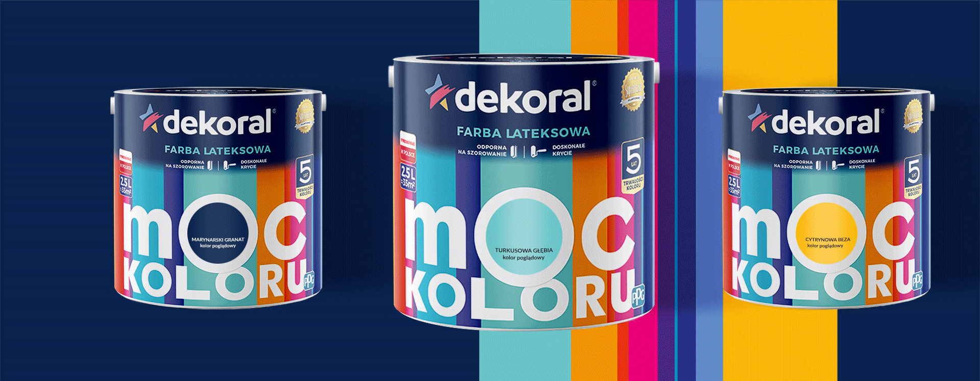
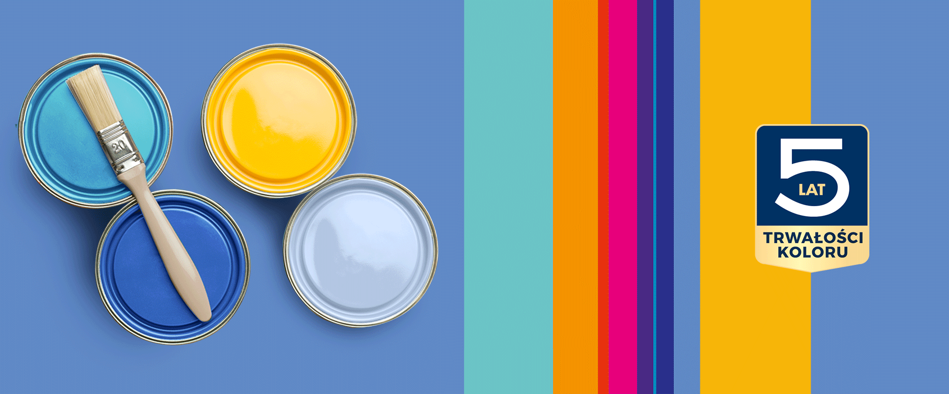
An energetic and eye-catching design for Dekoral packaging that fully reflects the character of the new naming and the quality of the products- that was the challenge we faced during the design process. The victorious creative concept, selected in consumer surveys, was based on the expressive typography of the name, in which the letter “O” is also a colour sticker. We translated the RTB of The Power of Colour line, representing a wide range of colours guaranteeing a multiplicity and diversity of possibilities, into an impactful background made up of colourful stripes associated with the strokes of paint rollers and brushes.
A structured hierarchy of messages and product benefits, presented through proprietary icons, gave the packaging design transparency. As a result, building customer trust in the brand became possible at the very first moment of contact with Dekoral’s new packaging design. Cooperation with the client resulted in additional designs of materials related to the launch of the paint line. We also prepared Key Visual with the claim “there is color, there is POWER!”, a series of POS, displays and color charts. Take a look at what Dekoral says about the new design!