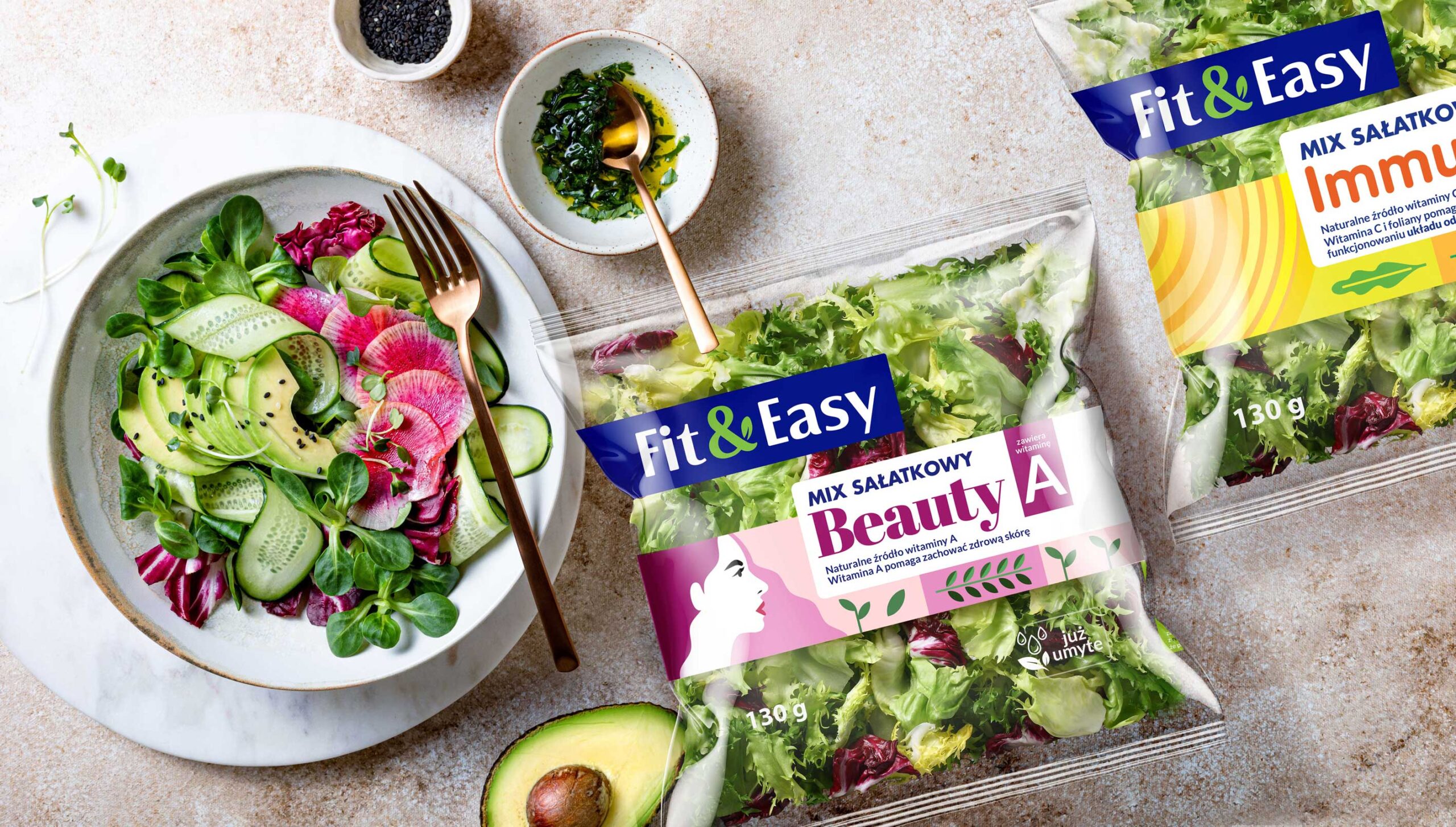
Owned by Green Factory, the Fit&Easy brand has been present on the Polish market since 2006. It is the undisputed leader in the salad mixes category, as well as an innovator in the fresh products category. Constantly expanding its product portfolio to include mono-vegetables, lunch boxes, as well as plant-based products, the brand needed to make its presence firmly felt in the market. So it needed to stand out at the level of packaging design.
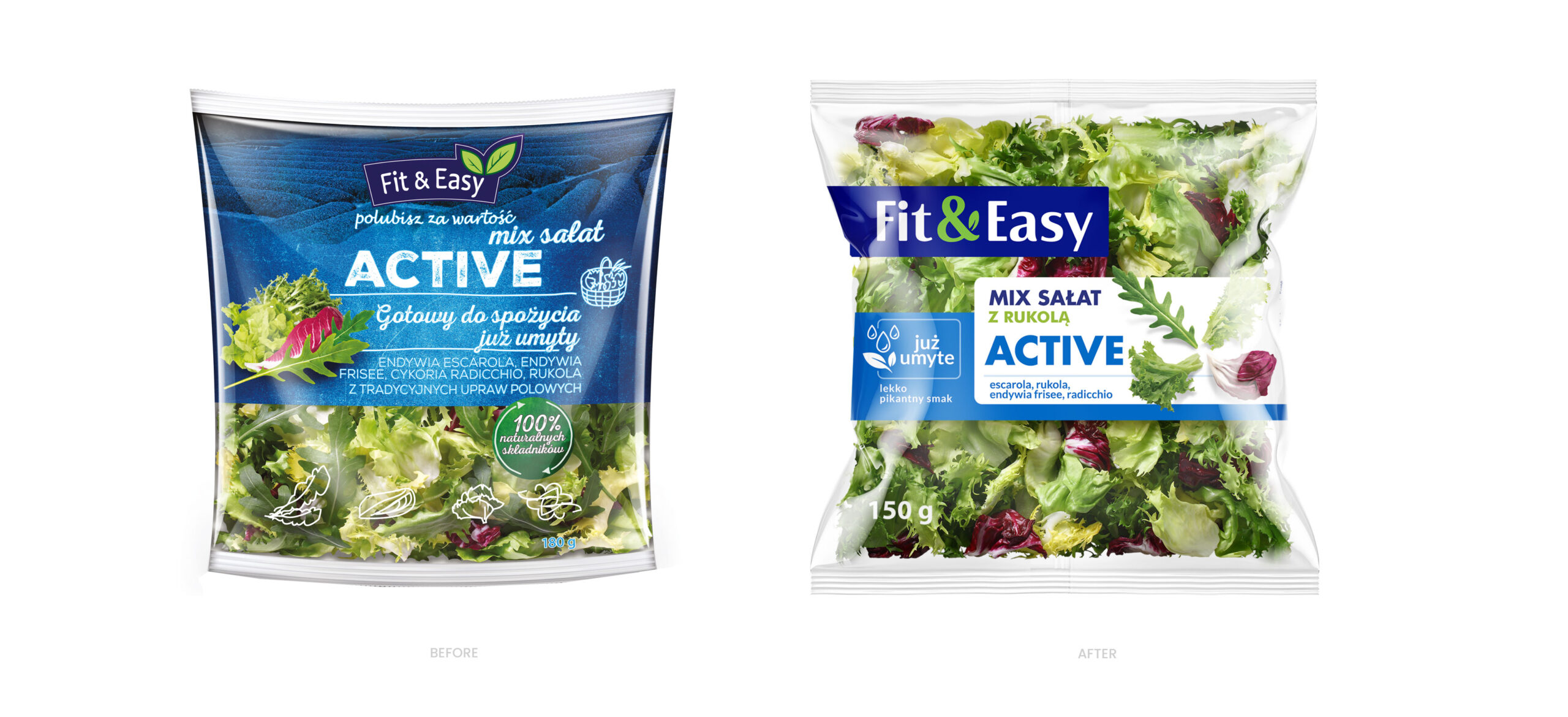
Fit&Easy established its leadership position by launching new products that quickly found their imitators in competitors’ offerings. Our agency was therefore keen to increase Fit&Easy’s brand recognition among buyers as well. This was due to the fact that the market share of fast-growing brands is increasing and, depending on the category, ranges from 50 to 80%.
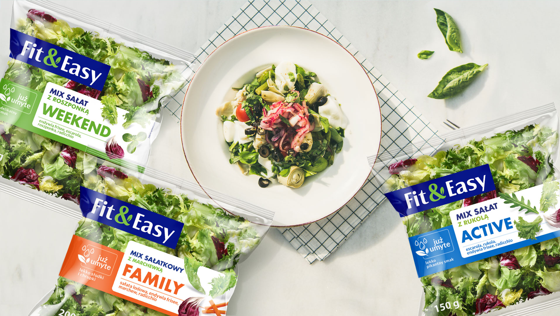
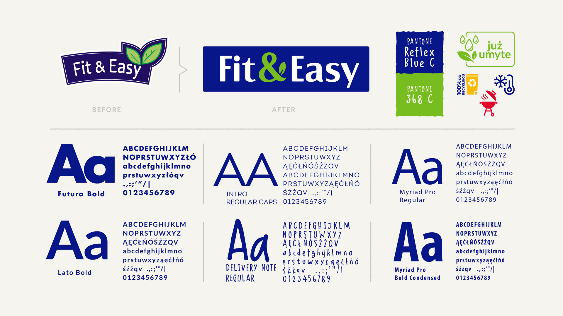
The main objectives of the implemented changes were to built a coherent identity and branding that allows for quick
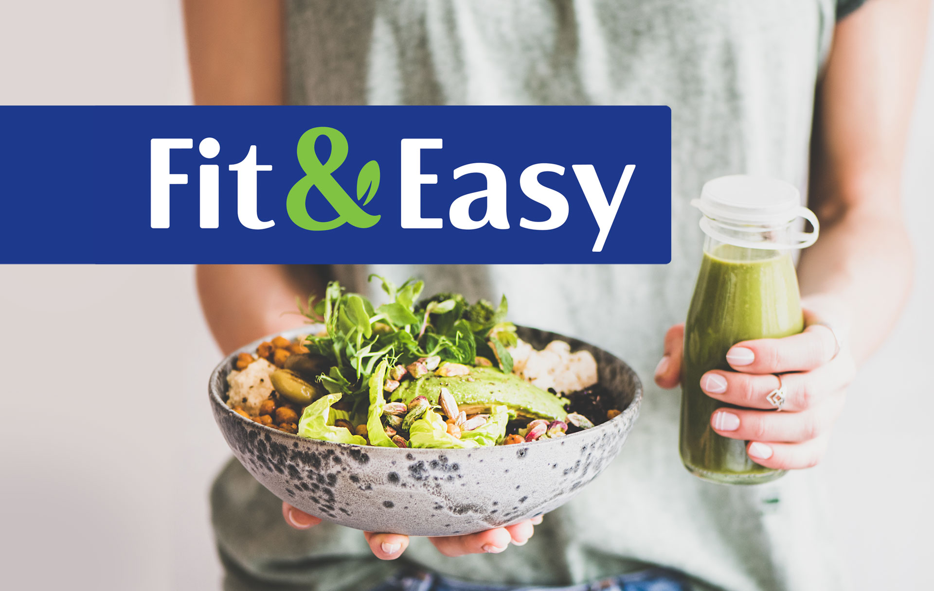
identification of both the brand and its quality. The developed logo is based on light. Modern typography and a navy blue colour that stands out well from the store shelf. The distinctive “&” sign, by its design and colour scheme, refers to the wellbeing-based positioning of the brand.
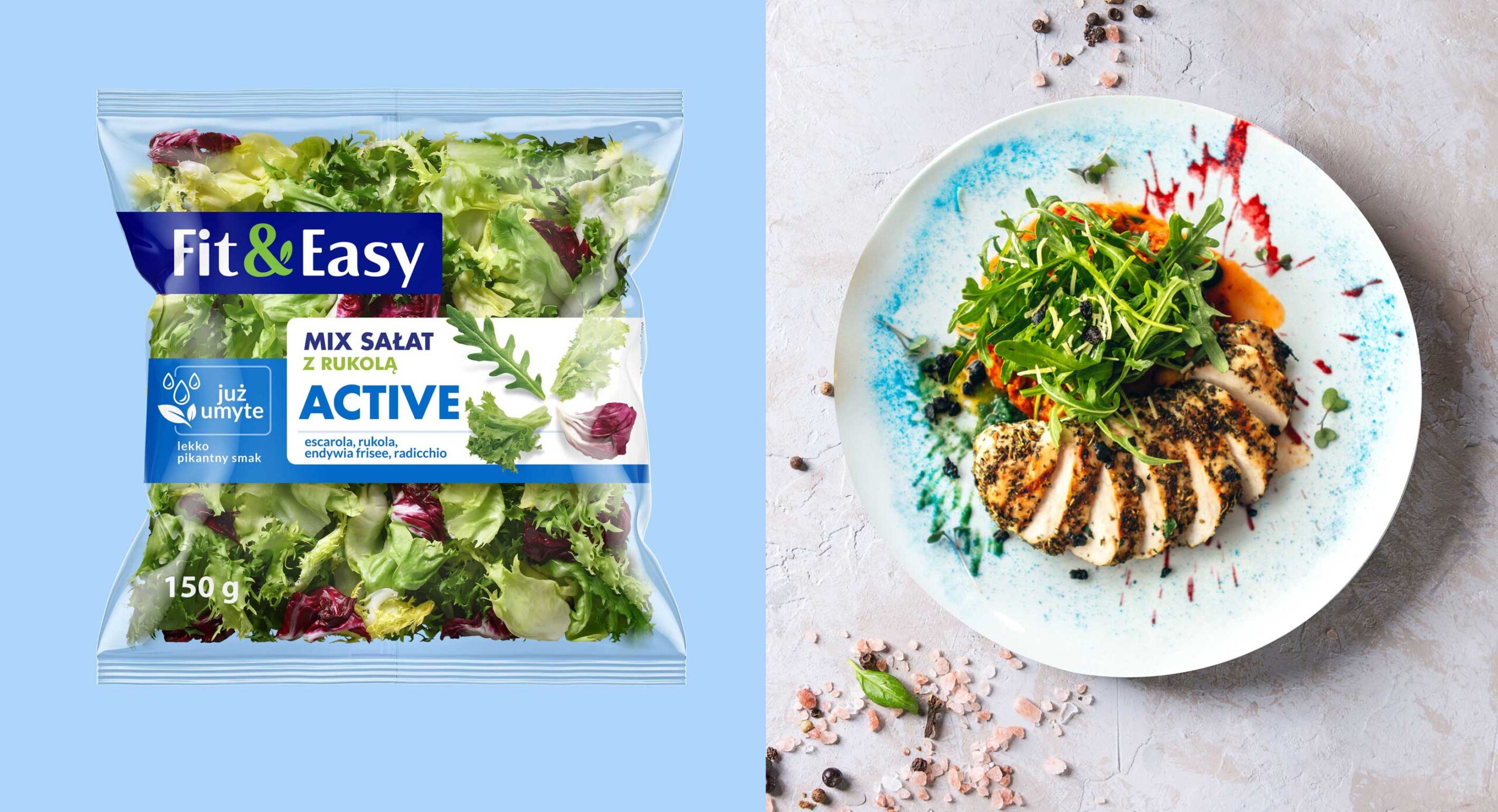
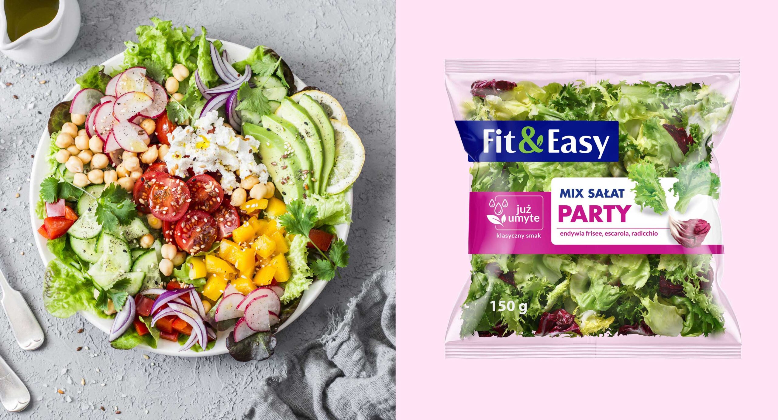

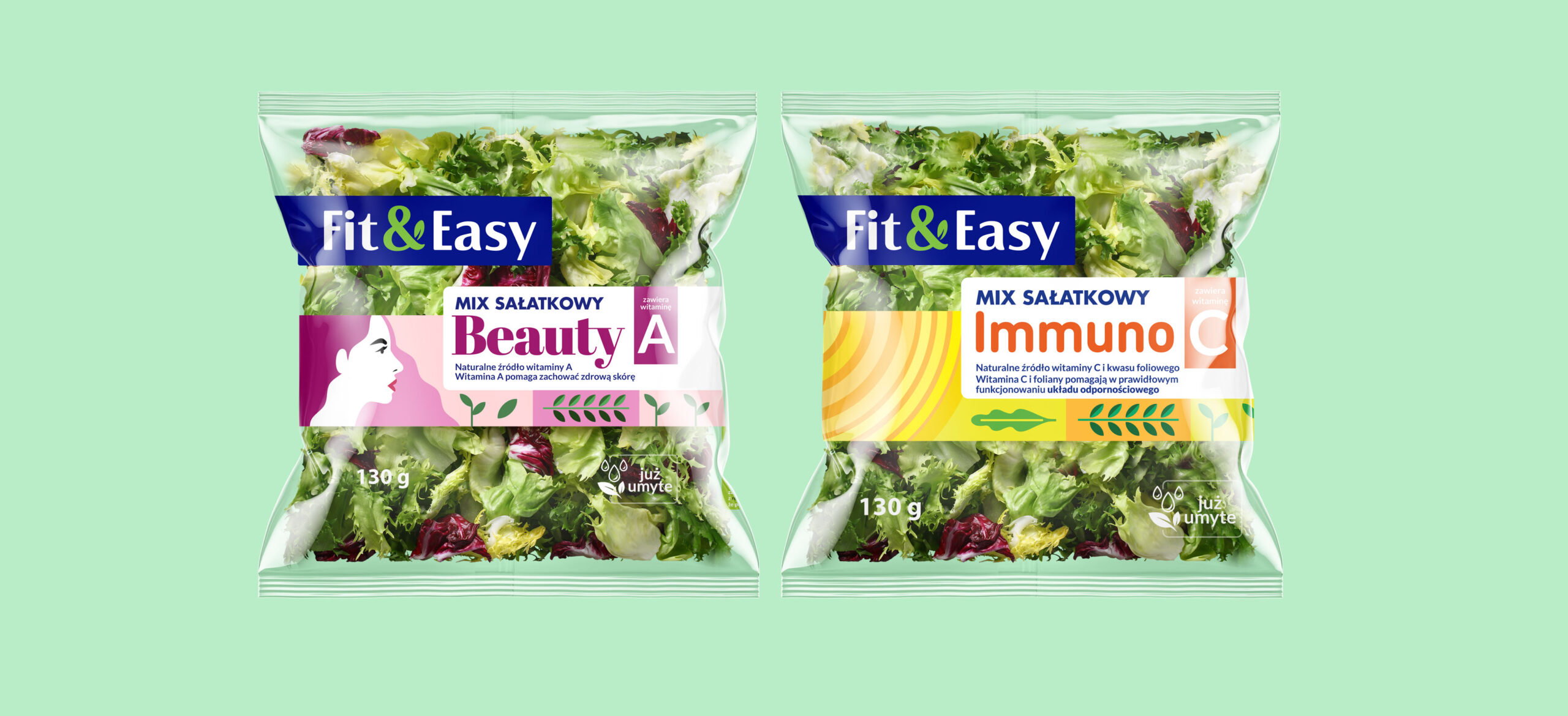
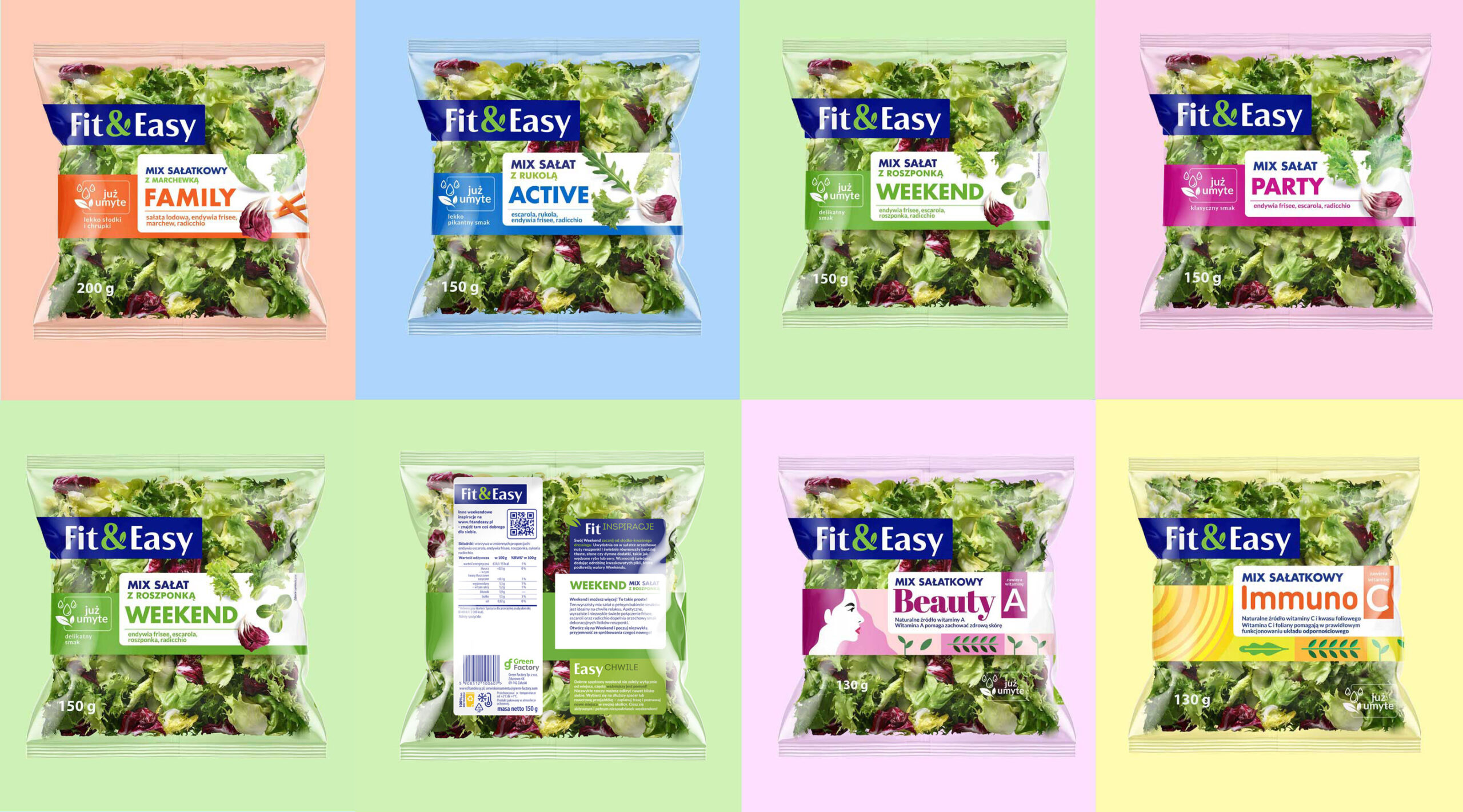
Designing the new packaging, we emphasized differentiation between product groups and and flavour variants. In this way, we have fit in with current trends in the world of packaging design. As a result of the work, we created branding, the idea of which was to present the complementarity of the Fit & Easy offer. We managed to do this on many levels of benefits, such as taste, freshness, health and convenient support during
a busy day. In order to differentiate the brand from the competition, we developed the naming of the various categories and products. We also handled the copywriting, emphasizing the brand’s role as a promoter of healthy lifestyle. The story we prepared is based on the brand’s message of caring for well-being and saving time, without sacrificing good taste.
Staying in the area of consumer-conscious branding, take a look at our project for the Paclan brand.
