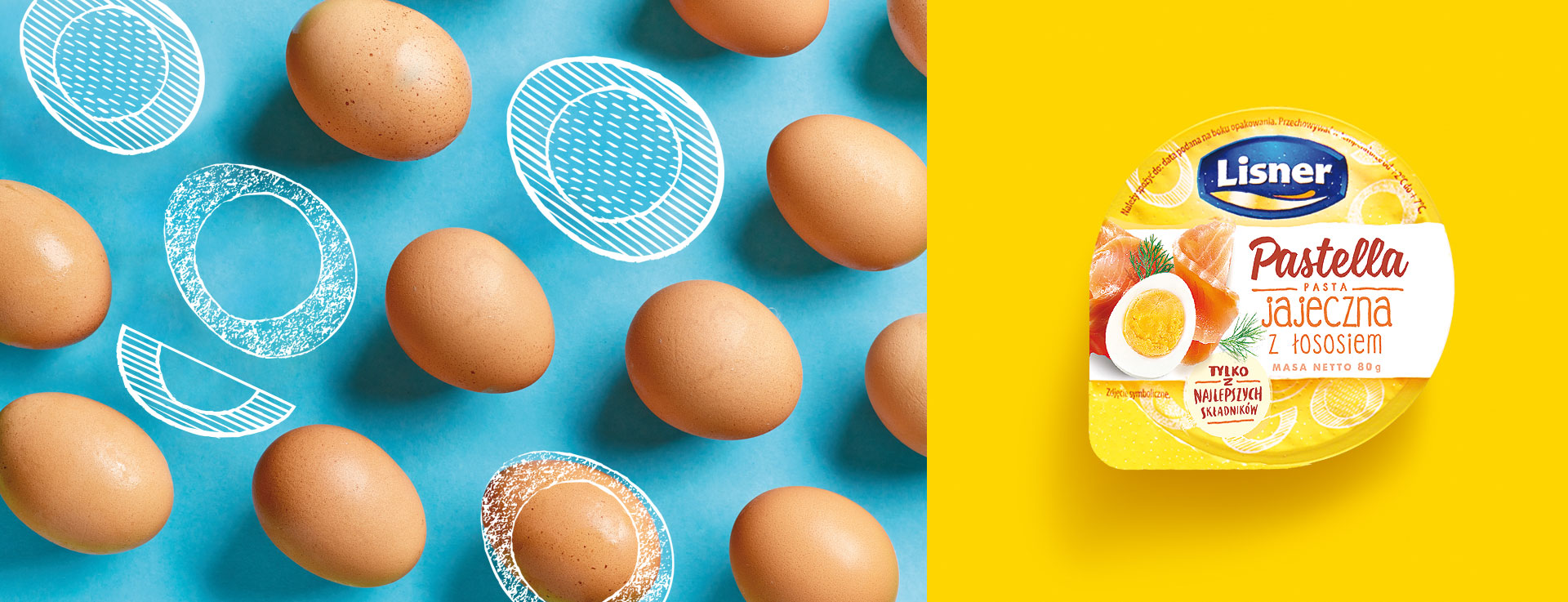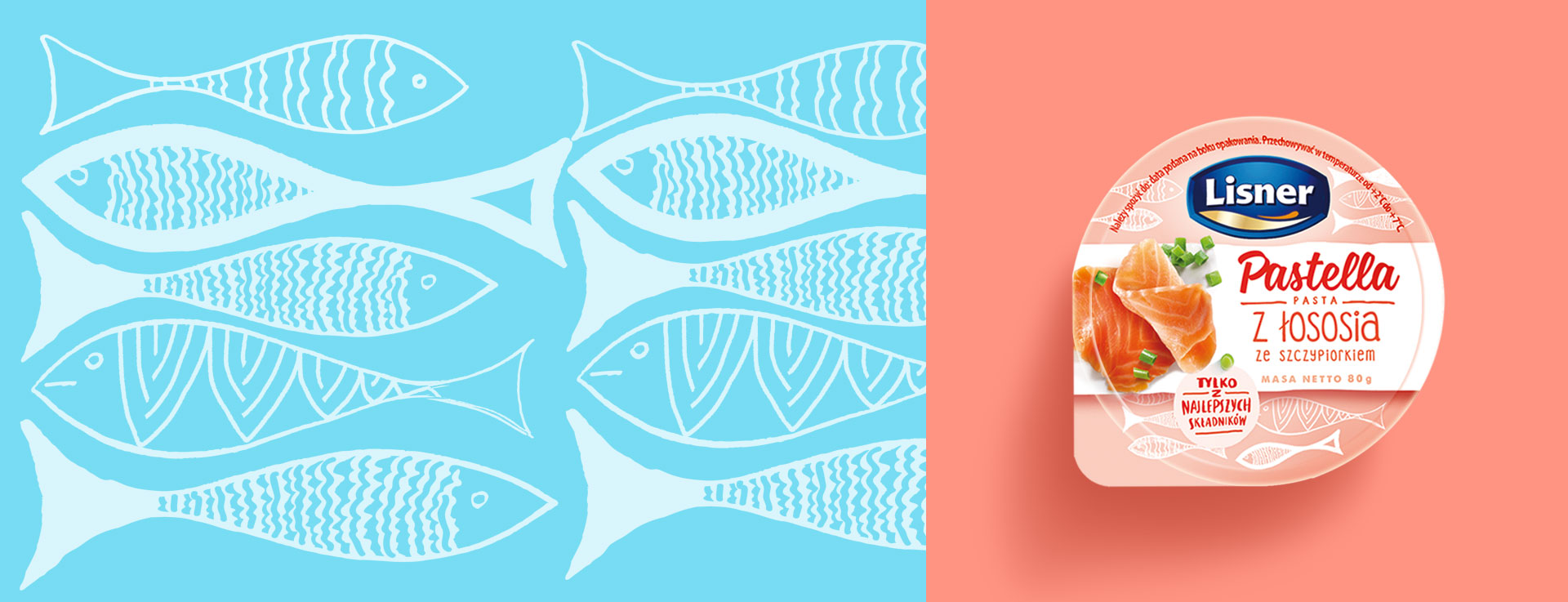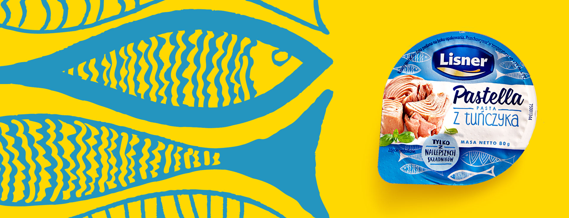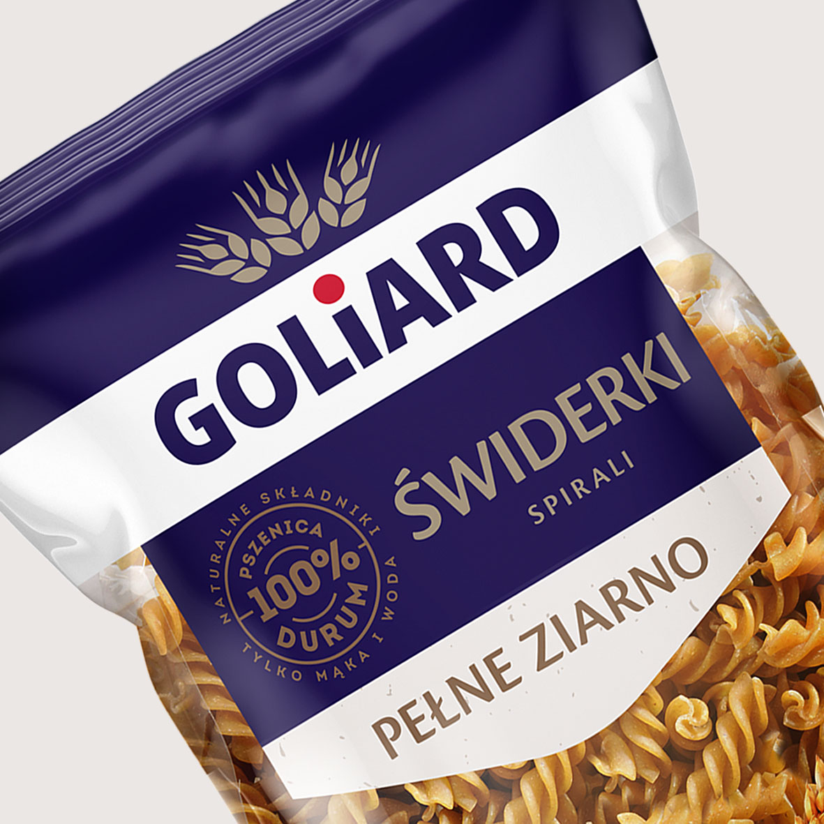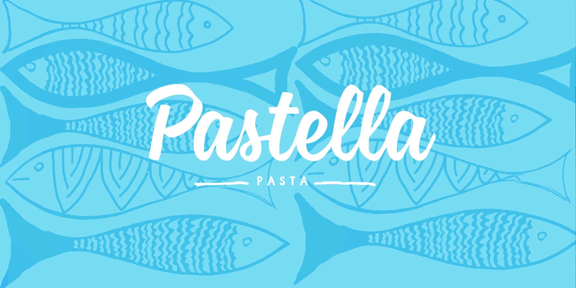
Image problems in the sandwich paste category and boldly discounted own brands that respond quickly to market impulses and create trends in packaging aesthetics. These are the two challenges Lisner faced with his brand Pastella. In this context, the brand’s packaging design had to be adapted to current trends and consumer expectations, and the product’s benefits were much more apparent. At the same time, we knew that we could not go too far with the changes, so as not to discourage the current loyal fans who were the category leader and enjoy Pastella’s best recognition.
At the beginning, we looked at global trends in the field of food packaging design and ingredient visualization, with particular emphasis on the category of fish products and pastes. Two directions dominated – photographic and illustrative. The combination of both provided a fresh brand image. At the same time, we have created a friendly and flexible system for distinguishing between categories and taste variants.
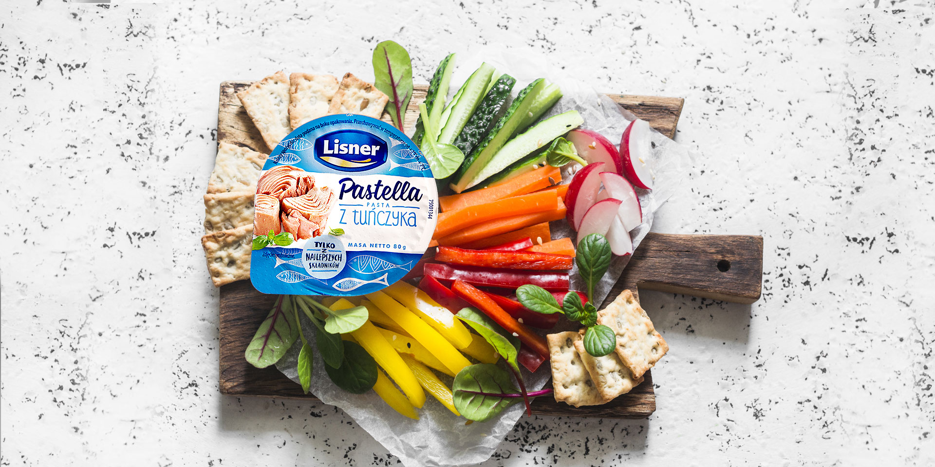
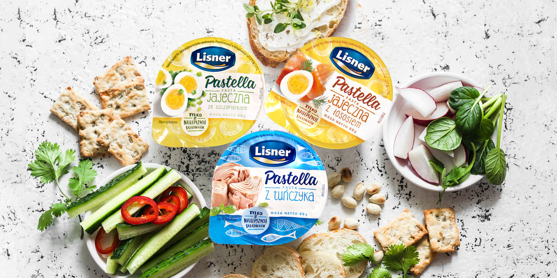
Contemporary design in the spirit of “handmade”, carefully selected typography and appetizing photos of ingredients allow you to emphasize the advantages of the brand. They include simple recipes and the use of healthy, high-quality ingredients. The new Pastella is exactly what young consumers and people making choices on the shelf are looking for according to the “I know what to eat” principle.