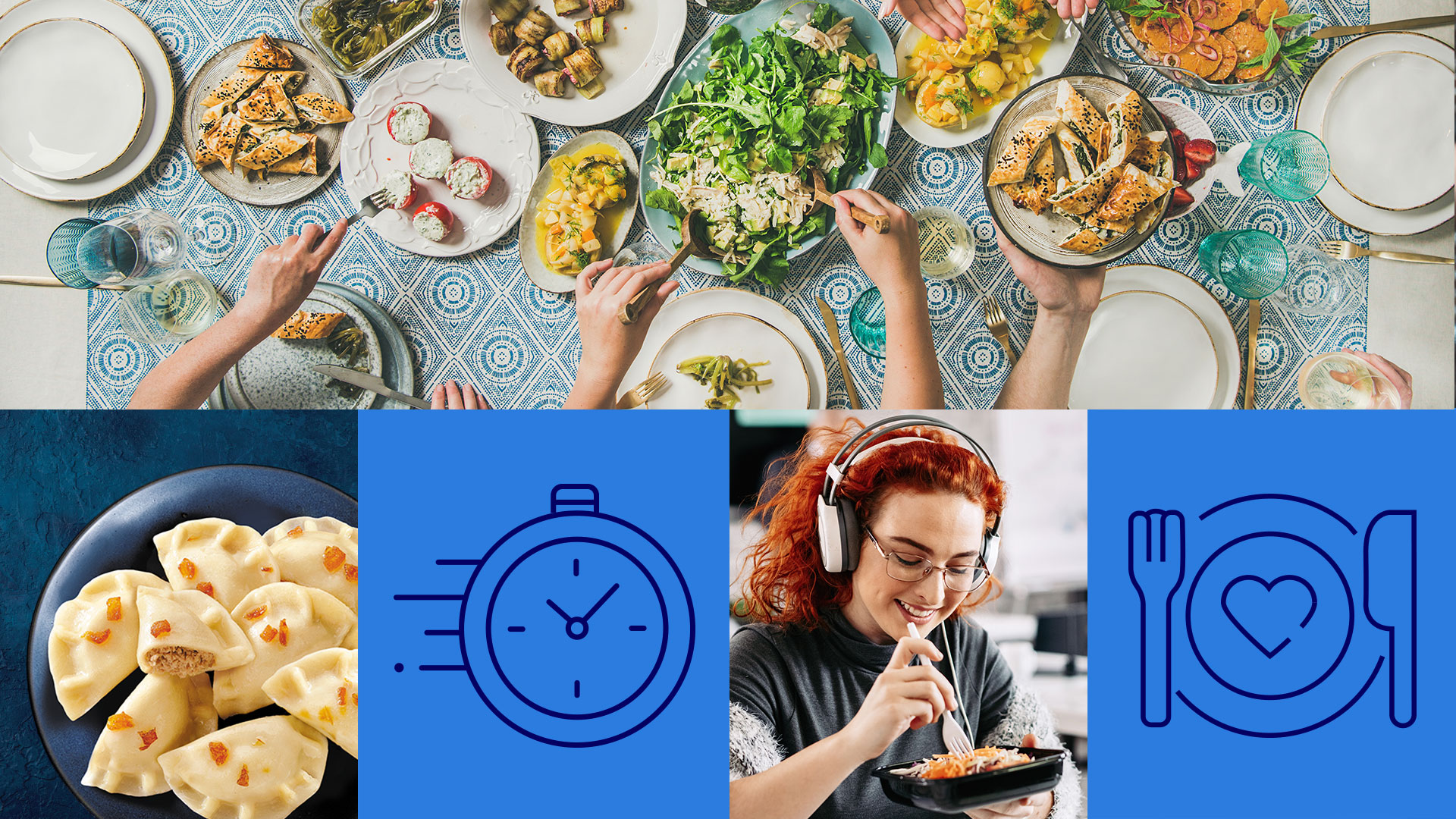
„U Jędrusia” company has come a long and fascinating way- from a popular Krakow’s restaurant founded in 1985 to a national leader in the prepared meals category. The brand, known for its wide range of products and attention to quality and taste, needed branding that exposed its values. The new image of “ U Jędrusia” was intended to attract more effectively new consumers interested in delicious and convenient dishes.
As part of the strategic project, which included a consumer research phase and workshops with the client’s team, we developed the creative concept for the new branding. The idea was to refer to the restaurant origins of “U Jędrusia”, as well as to present the satisfaction that the brand delivers in the areas of taste and time savings.
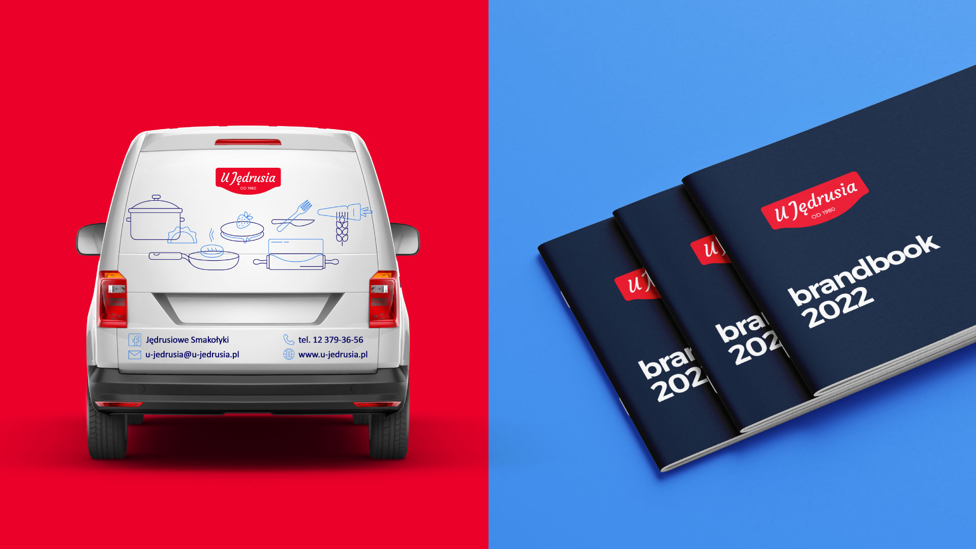
While working on the refreshed “U Jędrusia” logo, we drew inspiration from the history of the family business and modern gastronomy, where culinary traditions with modern trends.
We based the new mark on the shape of the restaurant signboard, and impactful colour scheme and quality typography. We enriched the refreshed logo with a claim “ Tastes good!” so that together with the new identity, it fully expresses the brand’s identity.
We prepared a comprehensive rebranding on two levels. The first- at the level of corporate changes, bearing in mind that the company is a producer of many brands but also a sponsor and patron of a number of events. Then, as the second level, we dealt with “ U Jędrusia” consumer brand, where packaging identification plays a huge role.
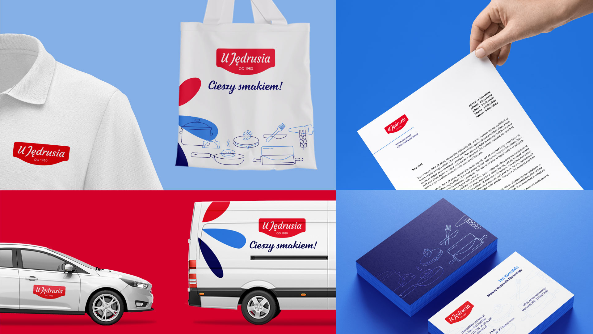
An important element of “ U Jędrusia: identification system is “ satisfaction symbol” that we created. It conveys the positive emotions that accompany encounters with the brand, both at the business and consumer levels. We supplemented the visual world of the brand with a system of icons communicating responsibility in action and strategic values derived from positioning: openness, passion and quality.
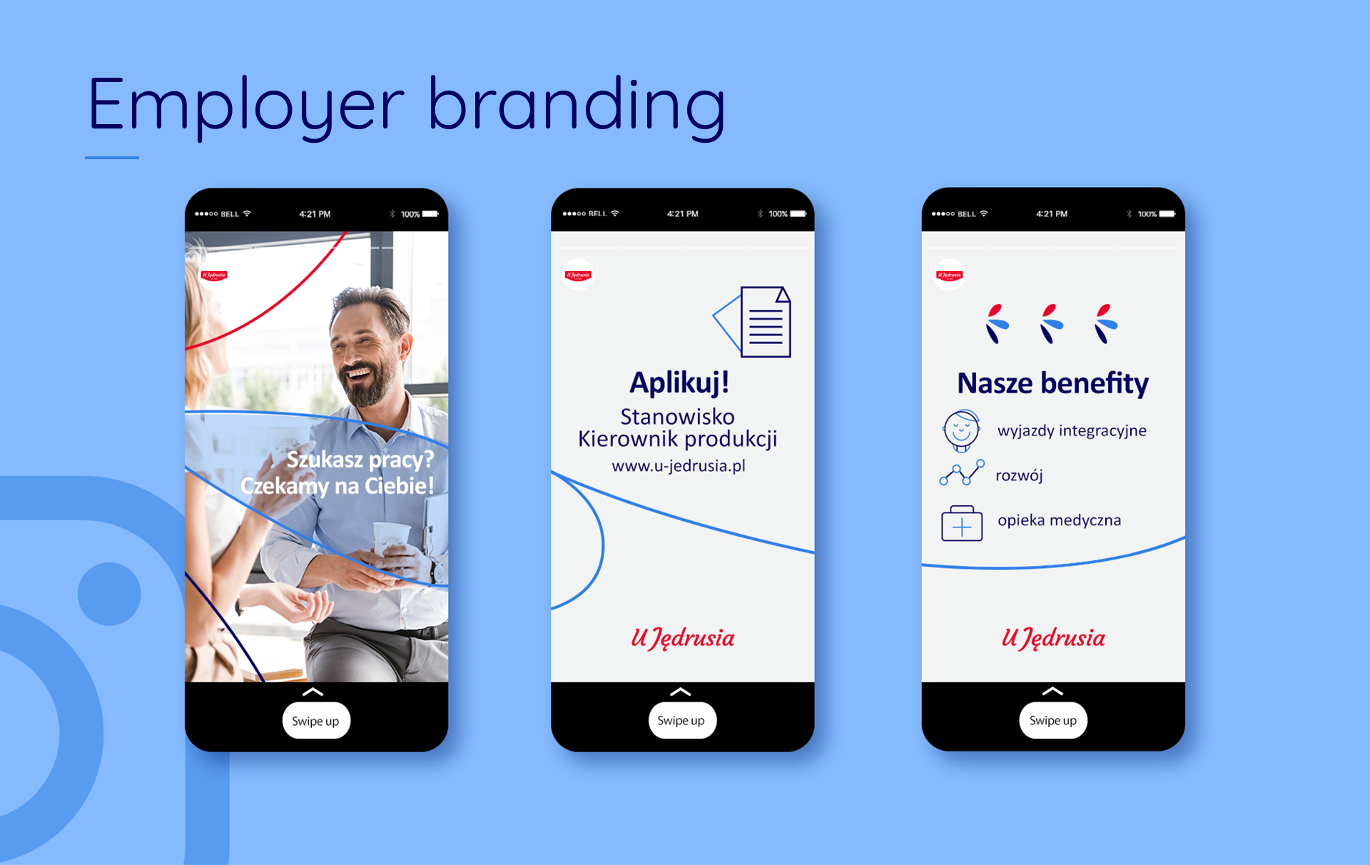
Also keeping in mind brand consistency, we created key visuals, stock stickers, sales presentations, employer branding materials and layouts aimed at social media. The brand book we prepared describes the rules for applying the identity to various media and communication areas.
As a result, ”U Jędrusia” brand gained branding quality and greater visibility, while fitting in with the design trends and aesthetics of the target group.