Olewnik is a family-owned company that has enjoyed the trust of customers for years. The brand combines knowledge and experience with product innovation but also responsible action. It effectively responds to the diverse needs of modern consumers. The new strategy, defined by the claim “ Food matters”, was the starting point for us to work on thoughtful branding and a distinctive packaging design for Olewnik.
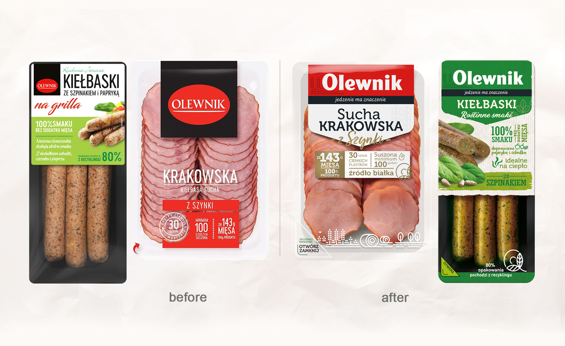
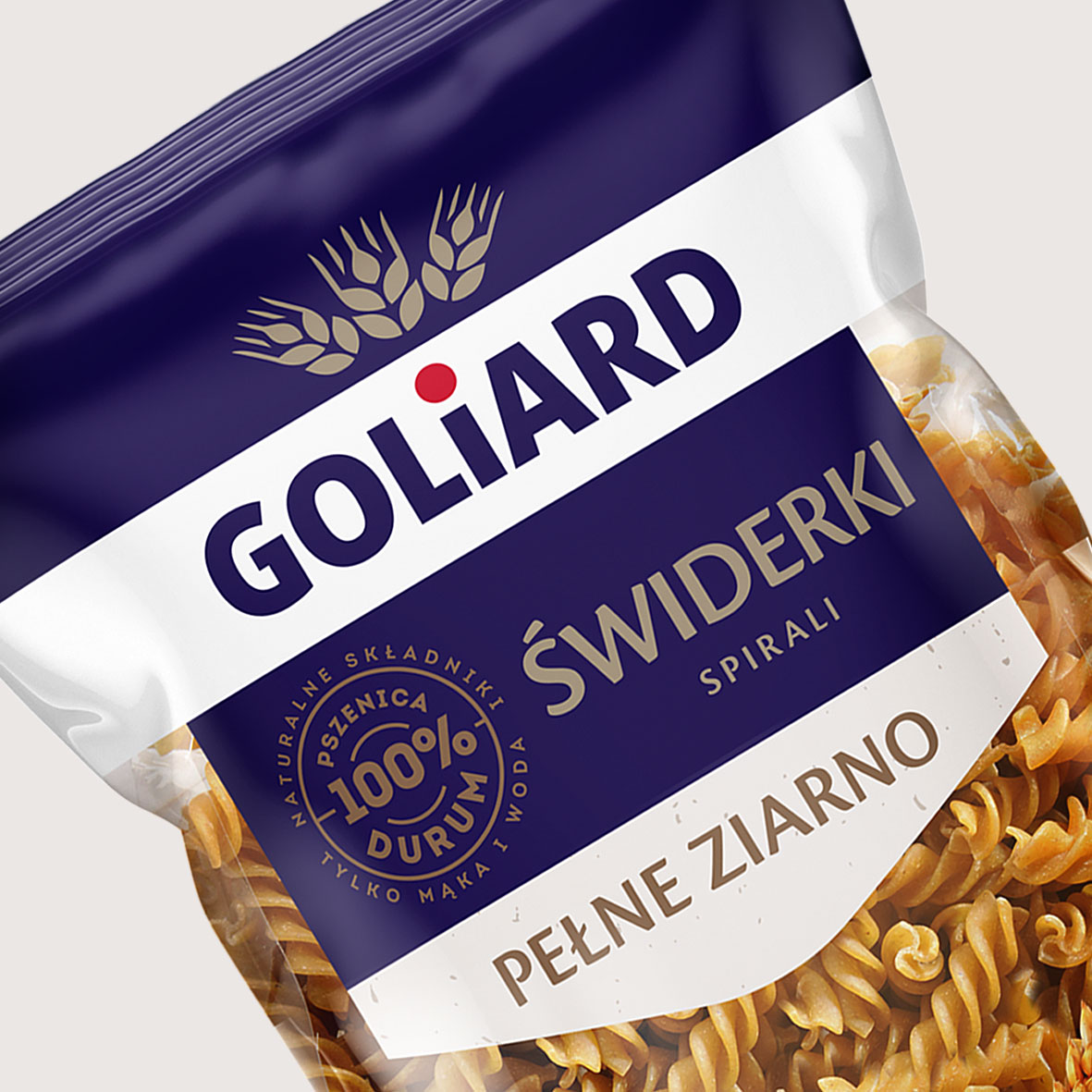
Before creating the concepts, we analyzed the brand’s situation and assessed the market competition. We also looked at the target group and identified market trends relevant to Olewnik’s new image. All this was done in order to, as a result of our work, offer the brand a new branding that would expose its values described in the strategy. The idea was also that the packaging design would clearly navigate to the given product groups, communicating good product compositions, precision manufacturing and environmentally friendly packaging ( limited amount of plastic).
Testing several creative ways, in close cooperation with the client, we developed a distinctive Olewnik identity and packaging design that communicates the brand values.
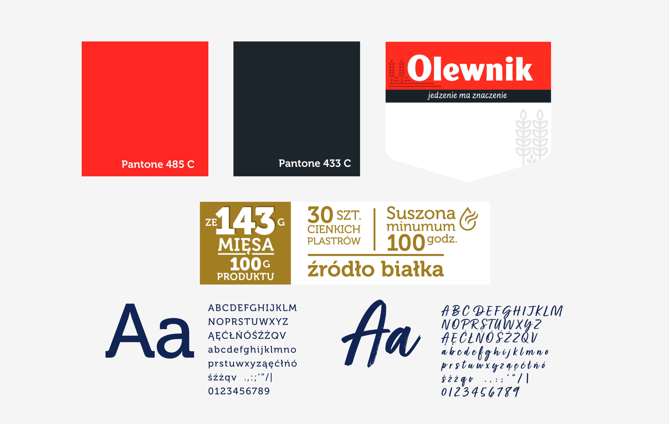
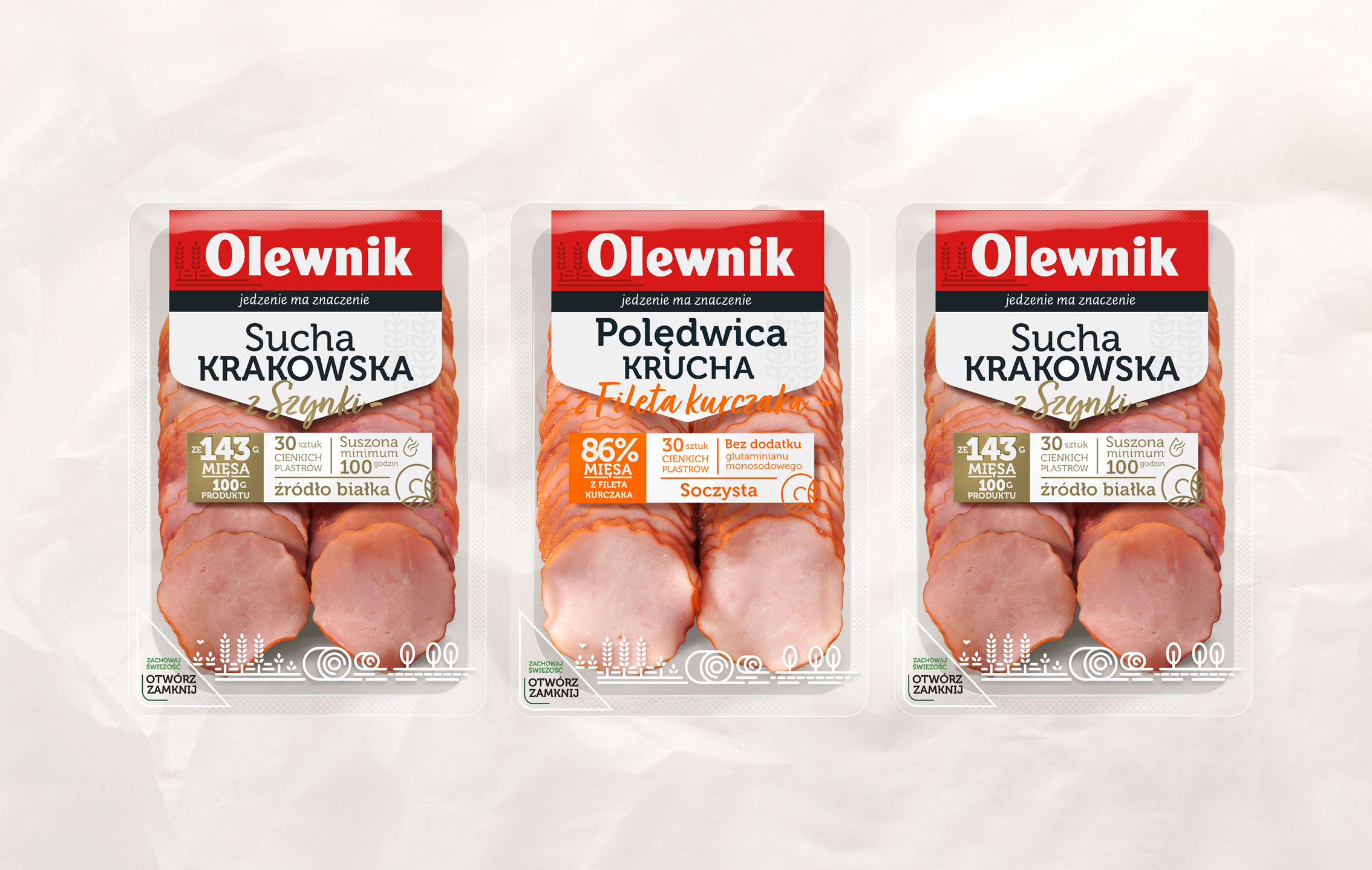
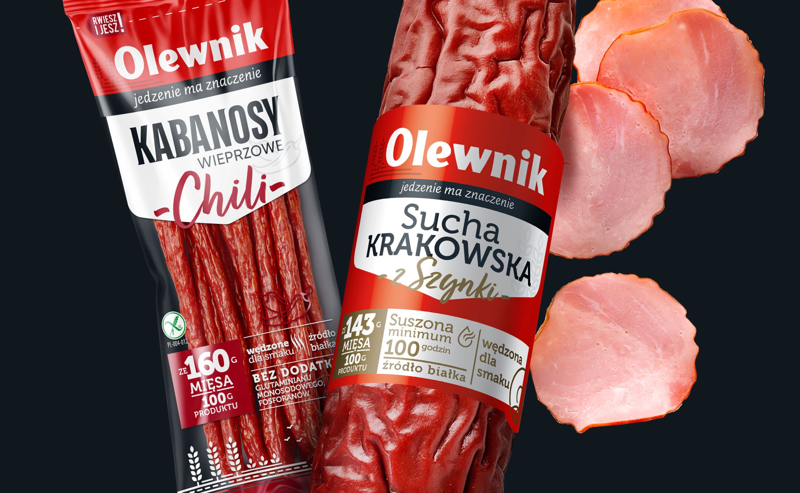
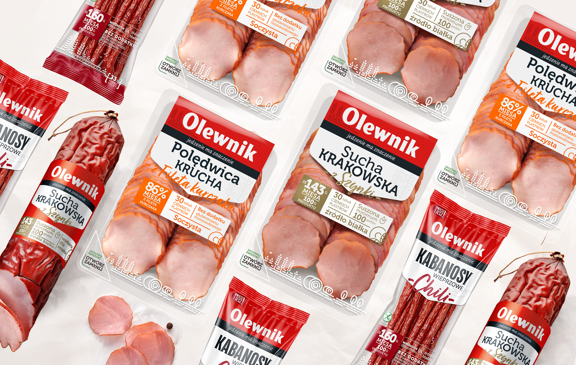
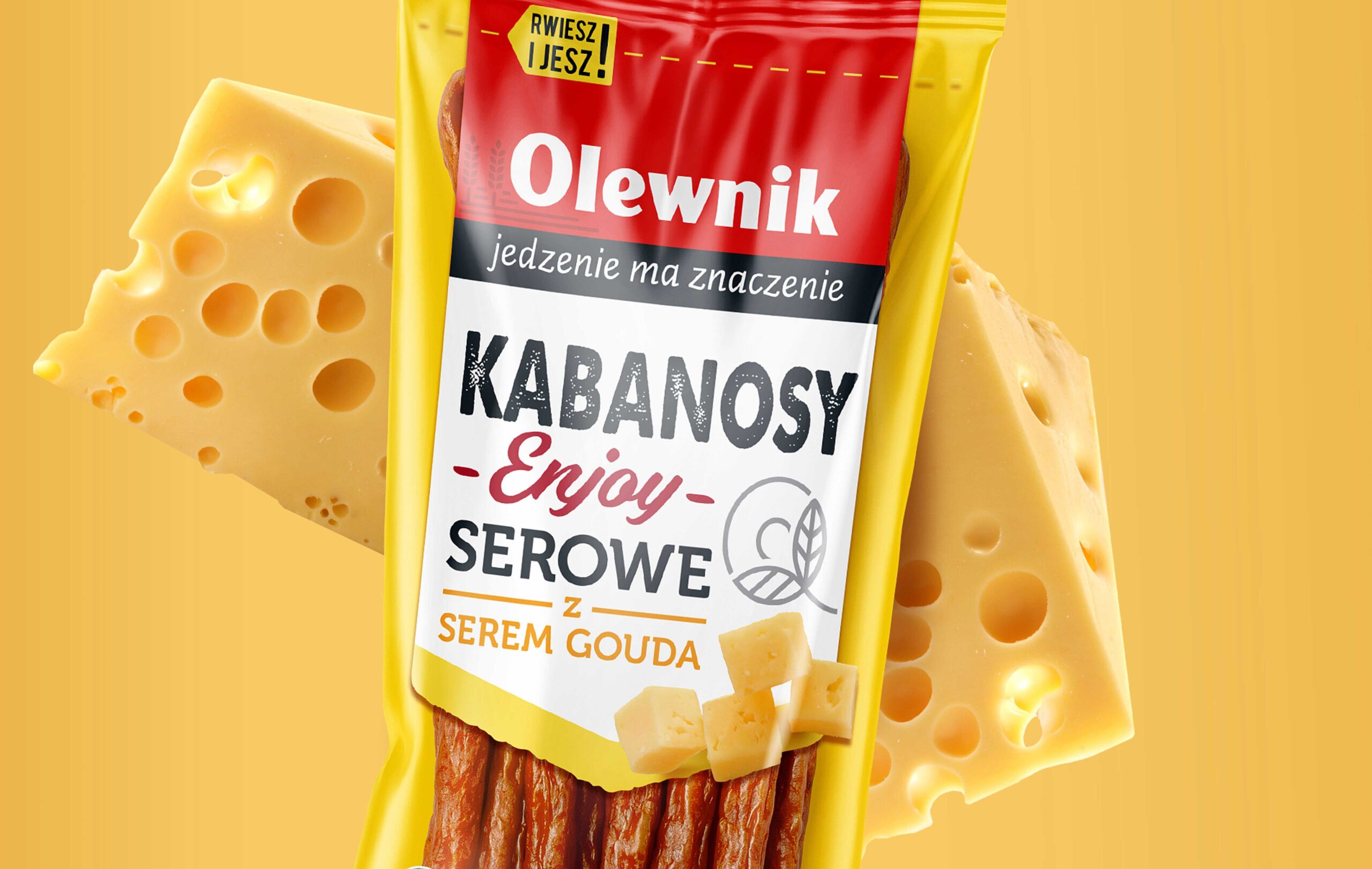
The refreshed logotype came into existence in an impactful branding shape designed by us. We enhanced the logo with appropriate claim typography and an illustrative brand world. This world presents natural and rural motifs, emphasizing responsibility and simple product compositions.
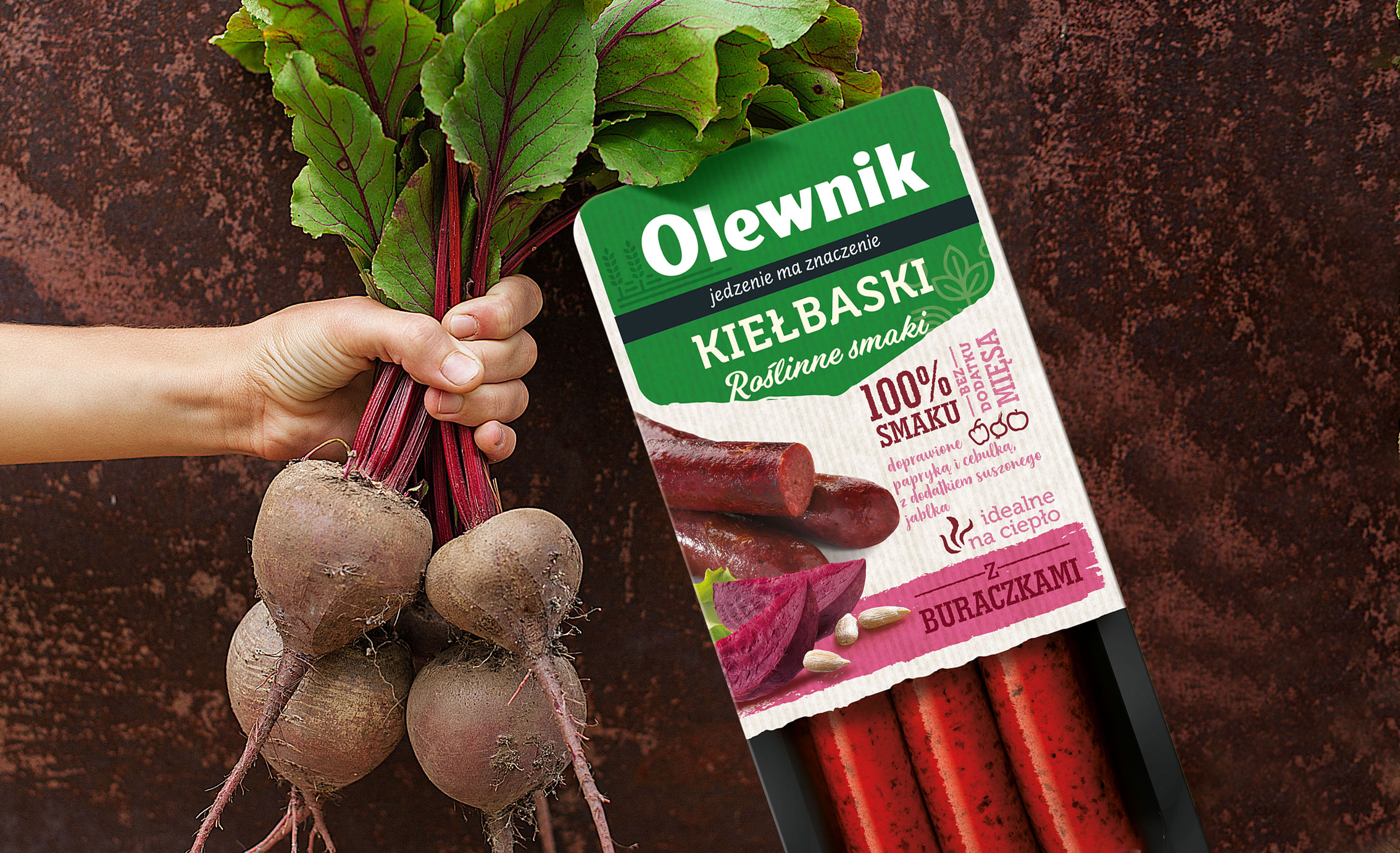
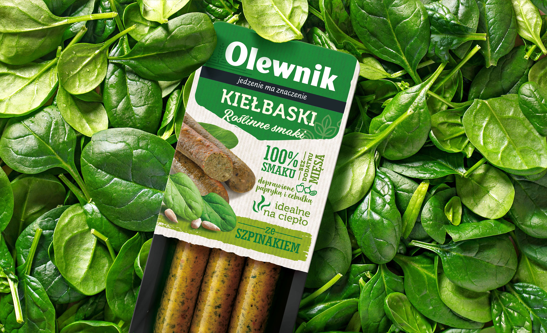
We prepared a proprietary Olewnik quality symbol that signs all the brand’s products, encouraging the consumer to choose a wide range of tasty products. Important in the work on the packaging was the translation of the brand’s strategic premise of transparency into its appearance. Accordingly, a large part of the packaging surface presents the products. The most important information about them is also well communicated – drying icons, types of additives, degree of meatiness, serving recommendations, method of opening, reduction of plastic in packaging.
The above-mentioned brand assets plus navigation between product groups, created a new, consistent architecture with a diverse product offering.
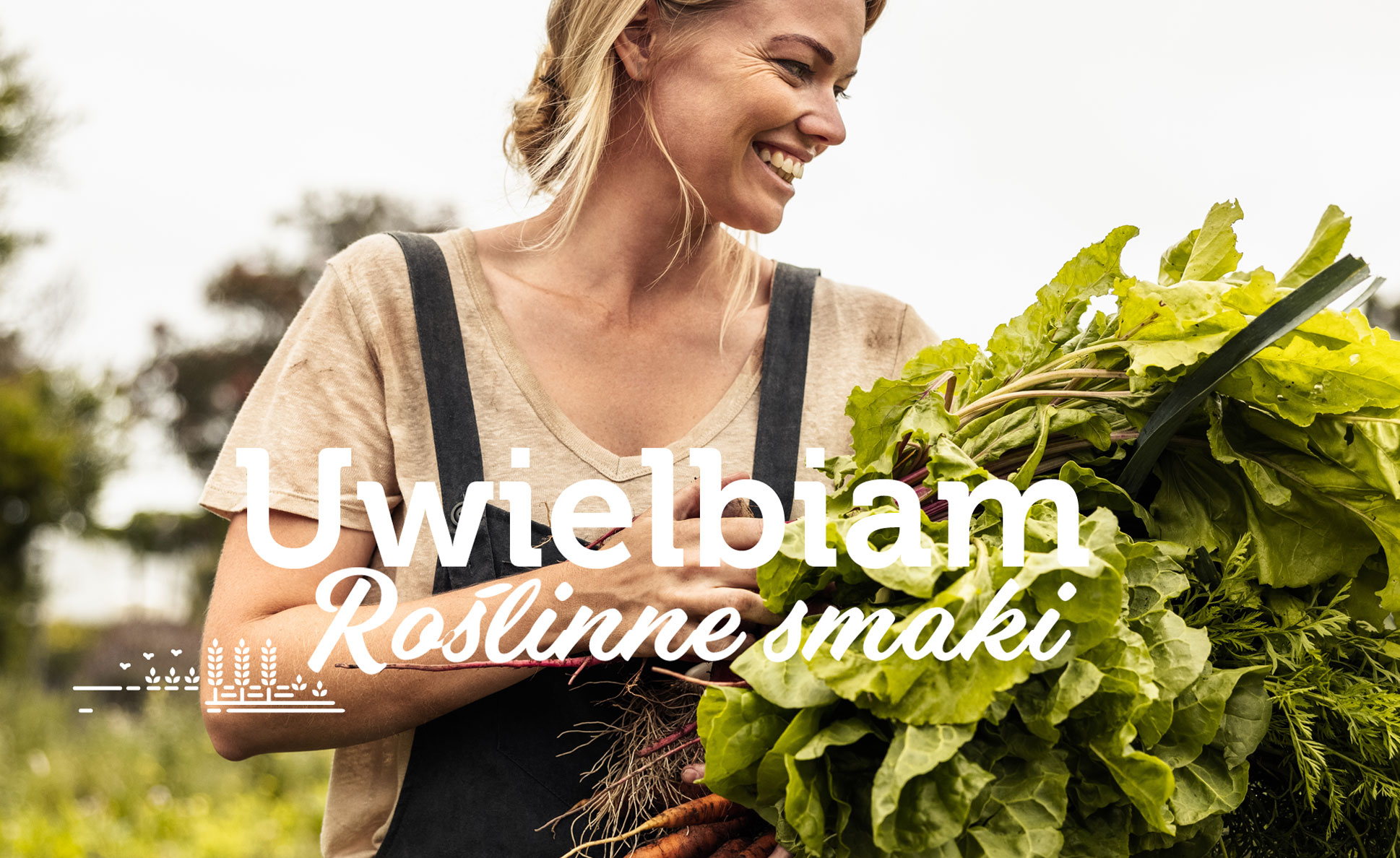
As a results, Olewnik’s new positioning and strategy gained its original and clear visual dimension. It is worth noting that Olewnik is also opening up to consumers who are cutting down or do not consume meat products. That’s why we designed a line of meatless products- Plant Flavours , bearing the Olewnik logo on a green background, with clear communication of the appetizing and plant-based composition of the products.
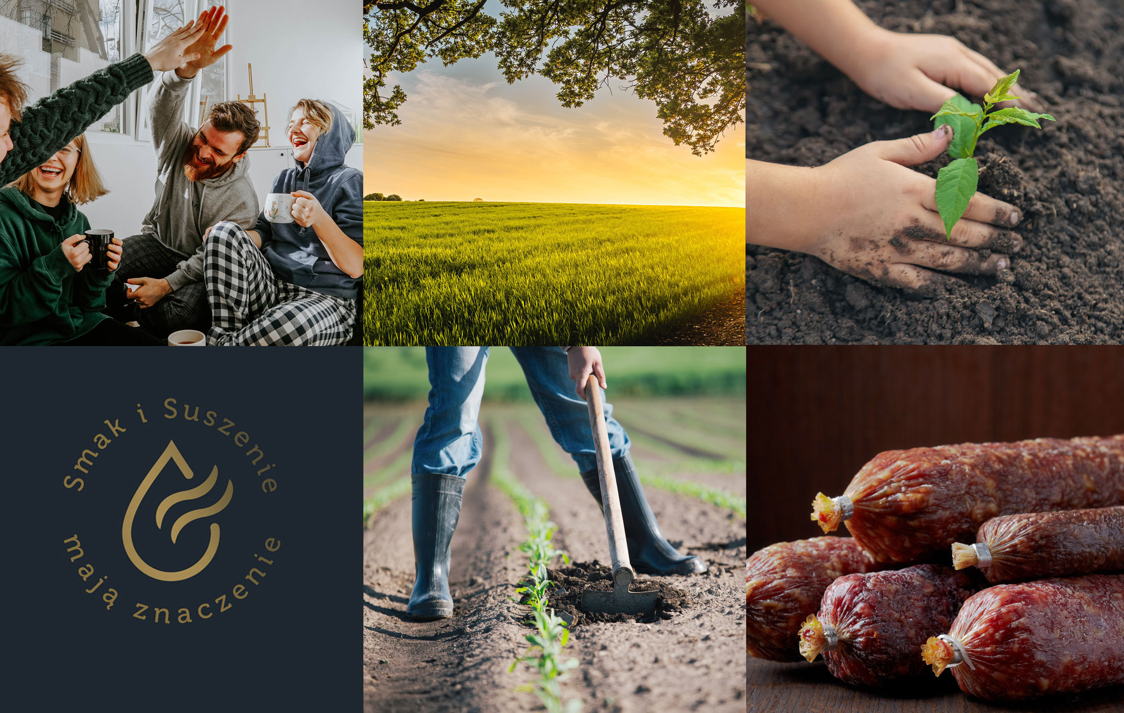
For this brand, we also developed KV of the much-loved by many consumers “dry krakowska sausage” with emphasis on the unique process of creating the product, we also prepared the brand book Olewnik 2021. In summary, behind us is a demanding, multi-stage and very rewarding work on the Olewnik brand. The rebranding of this brand is another example of a successful project. Now it remains to try, taste and savor.