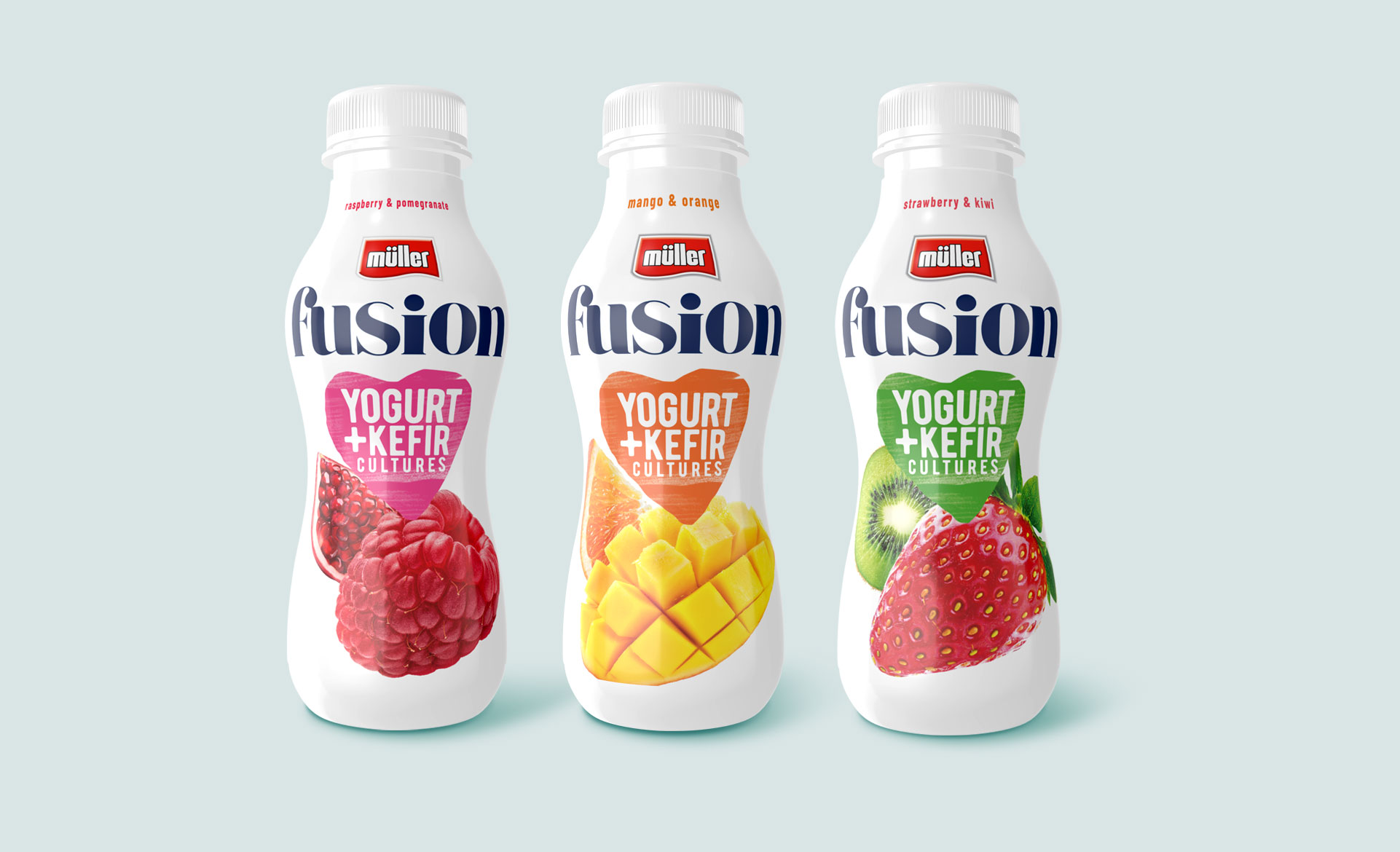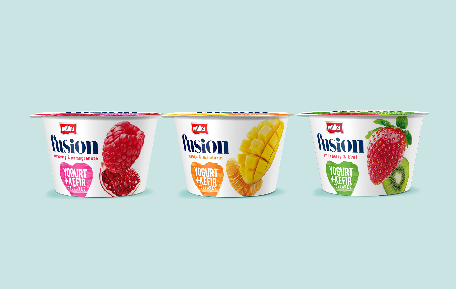
Müller is a large European brand offering dairy products to customers across the continent – desserts, drinks, yoghurts. It is known for innovation and the introduction of interesting, ahead of the competition, product concepts. Branding and packaging design for one of these products was the goal that the brand set for us. The milk drink, a combination of kefir and yoghurt, was supposed to stand out from the shelf, fresh and “catchy” for the consumer. This is a unique product that deserved an equally creative and distinctive approach. How did we do it?
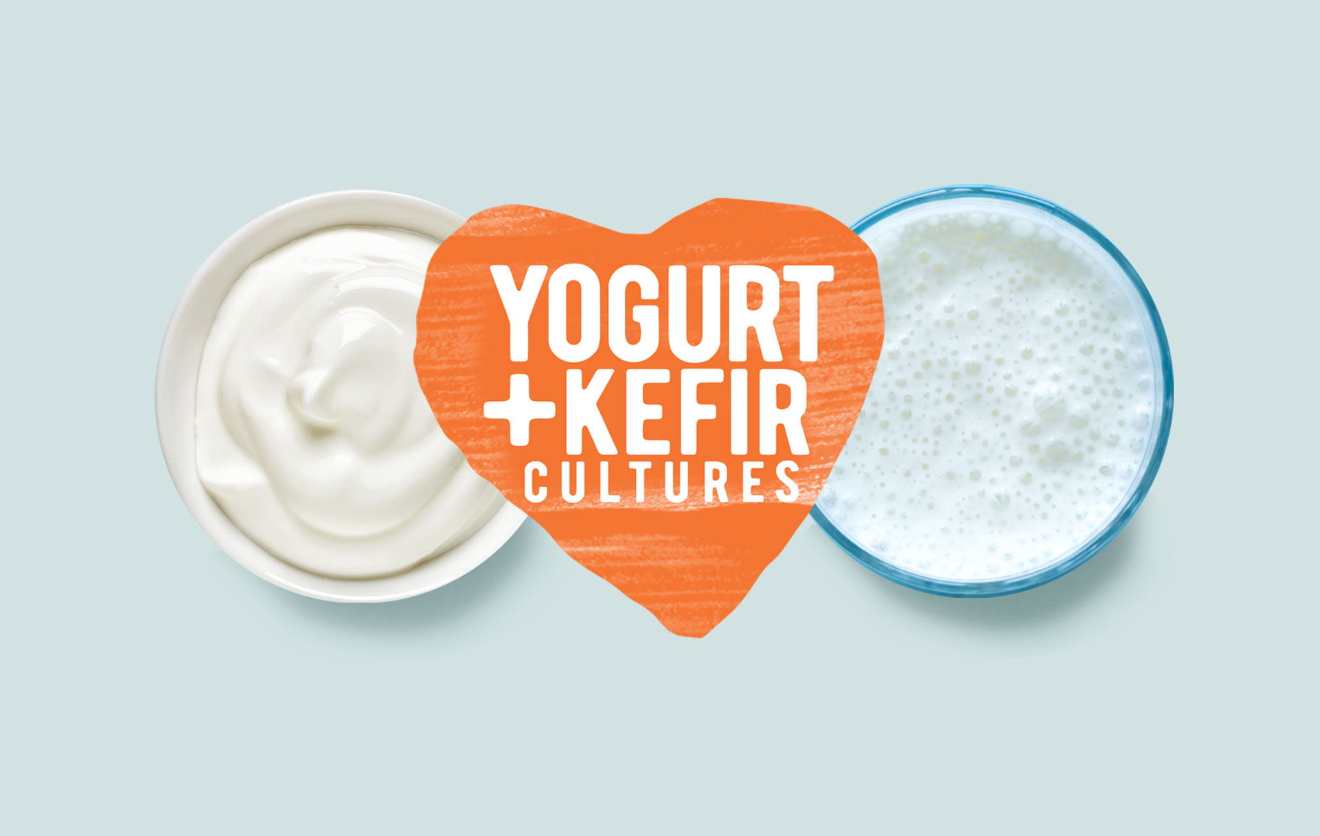
When preparing branding and packaging design solutions for the new Fusion sub-brand, we focused on creating an eye-catching branding product that reflects the nature of the product. We were looking for graphic solutions that would adequately reflect the full taste, freshness and health-promoting nature of the drink. We achieved this by referring to what is most important in Müller – milk.
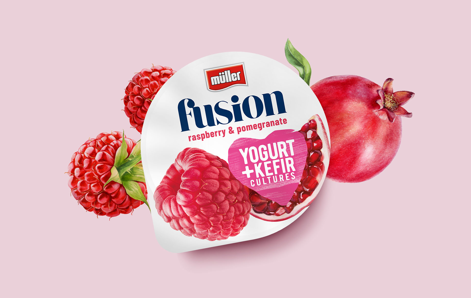
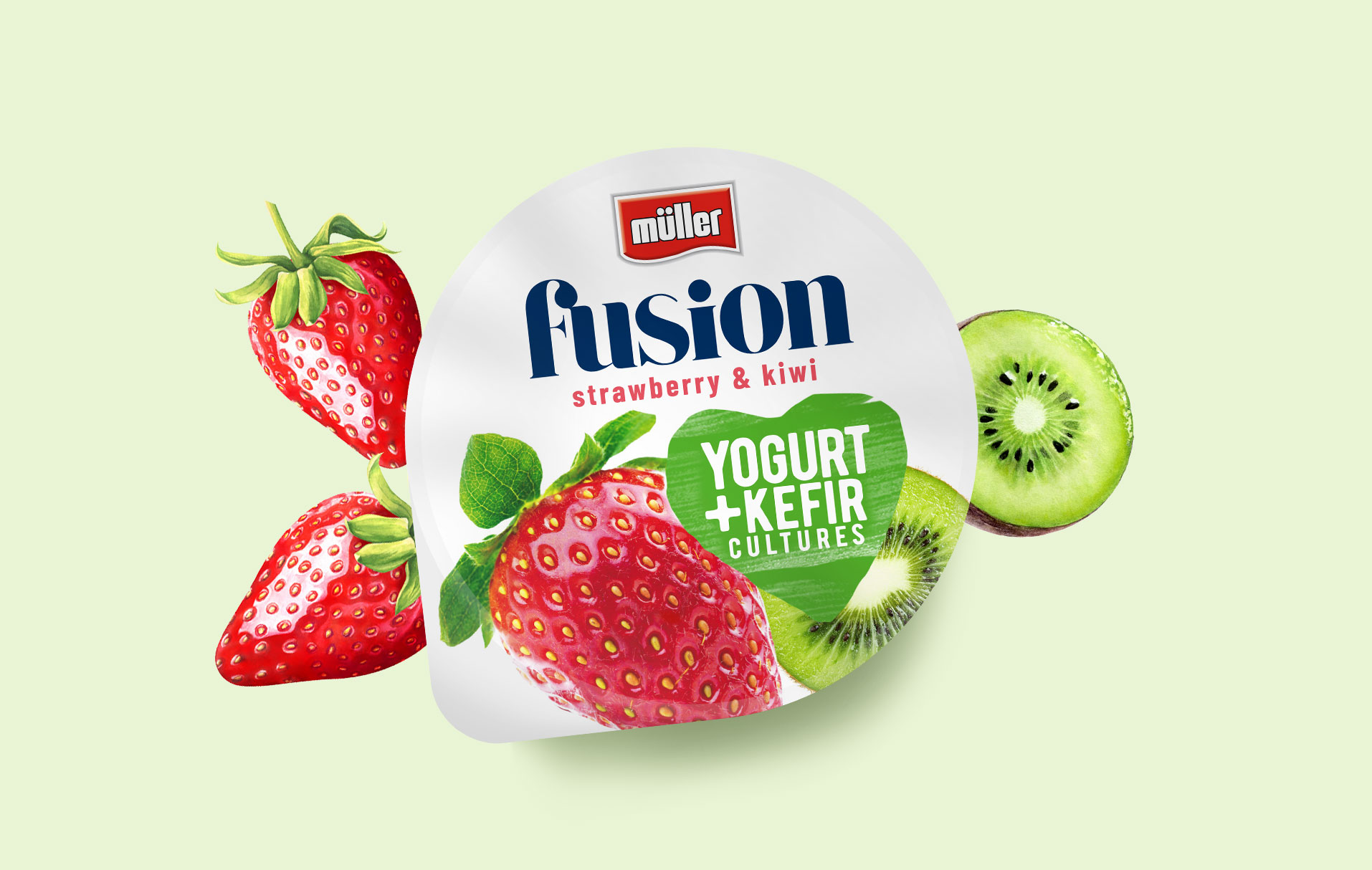
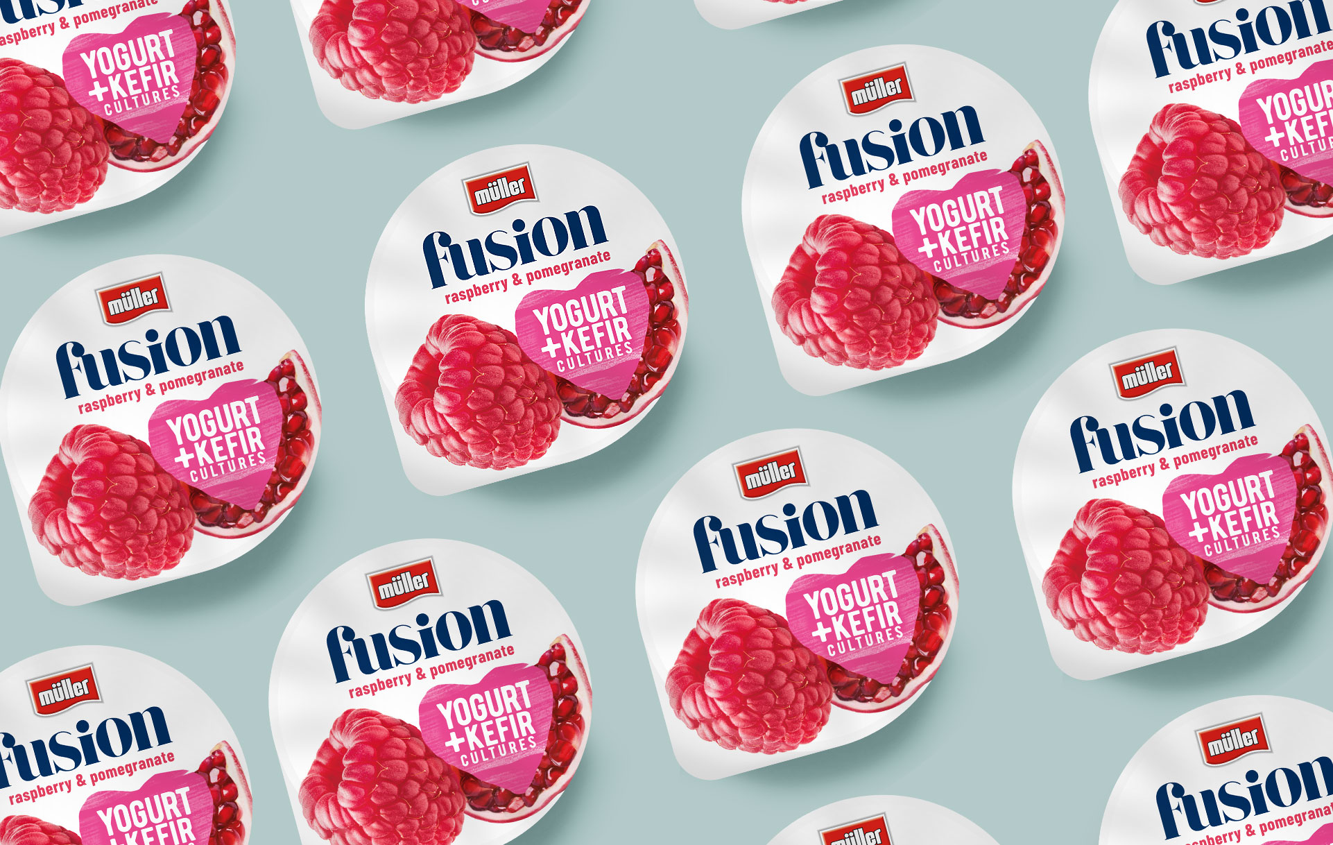
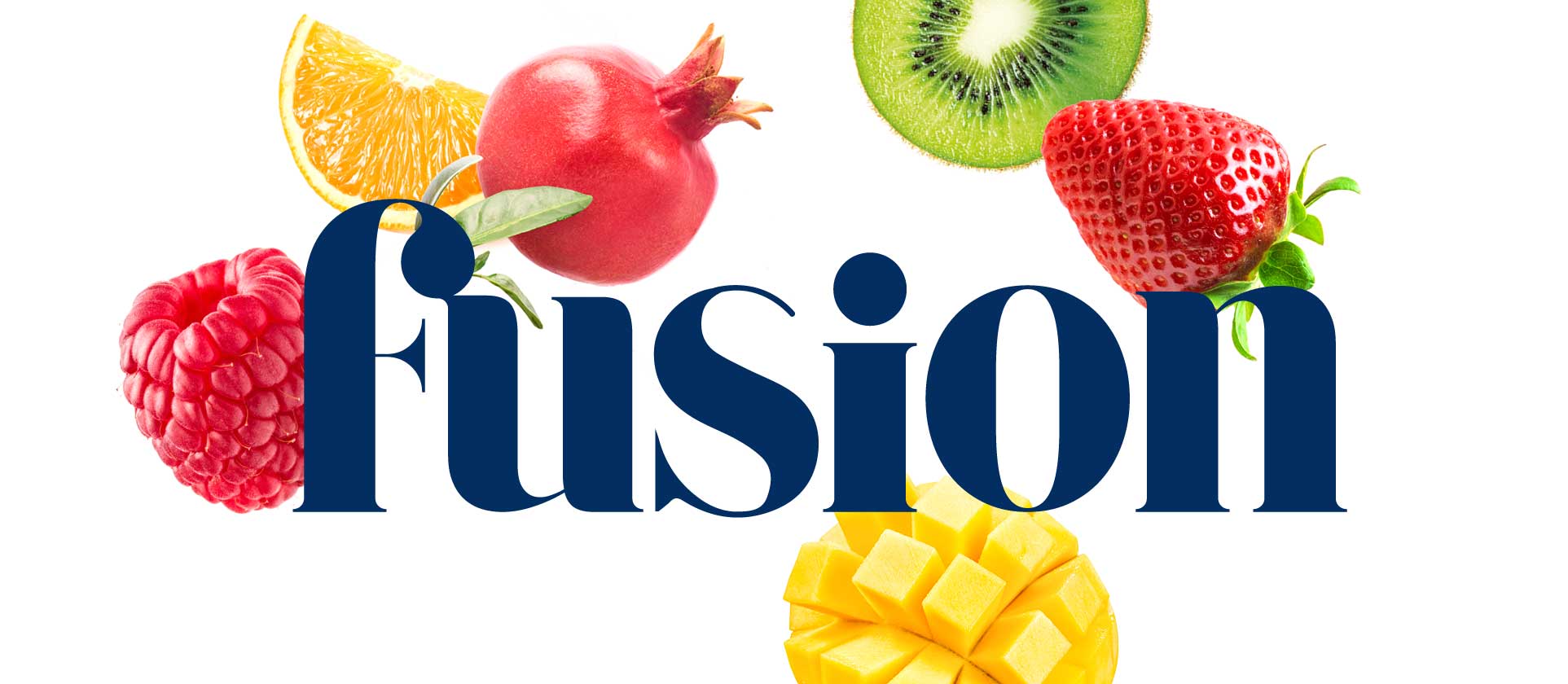
The white, minimalist packaging is distinguished by a juicy product demo, and the selected logotype font, like the product itself, combines noble tradition with modernity. The result is a design firmly embedded in the category and standing out against the background. Light and serious at the same time, white and colorful at the same time, and most importantly – communicating the taste and the main advantages of the product well. You have to try this!
