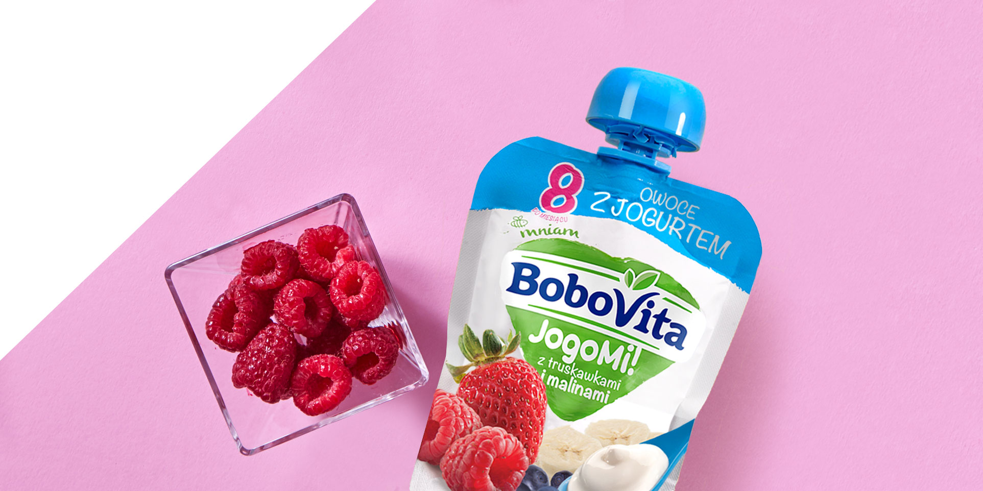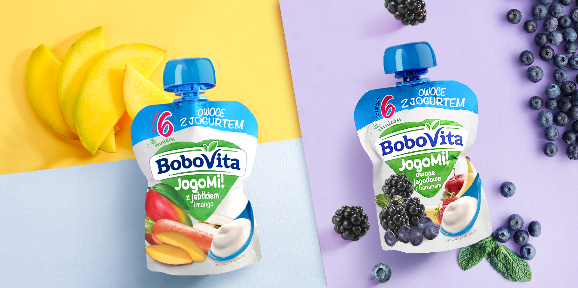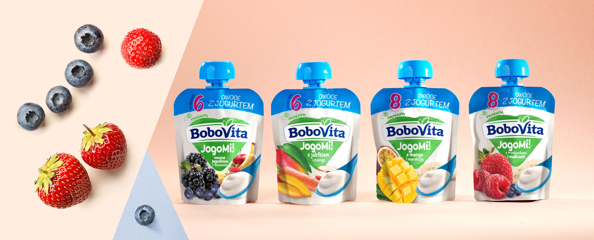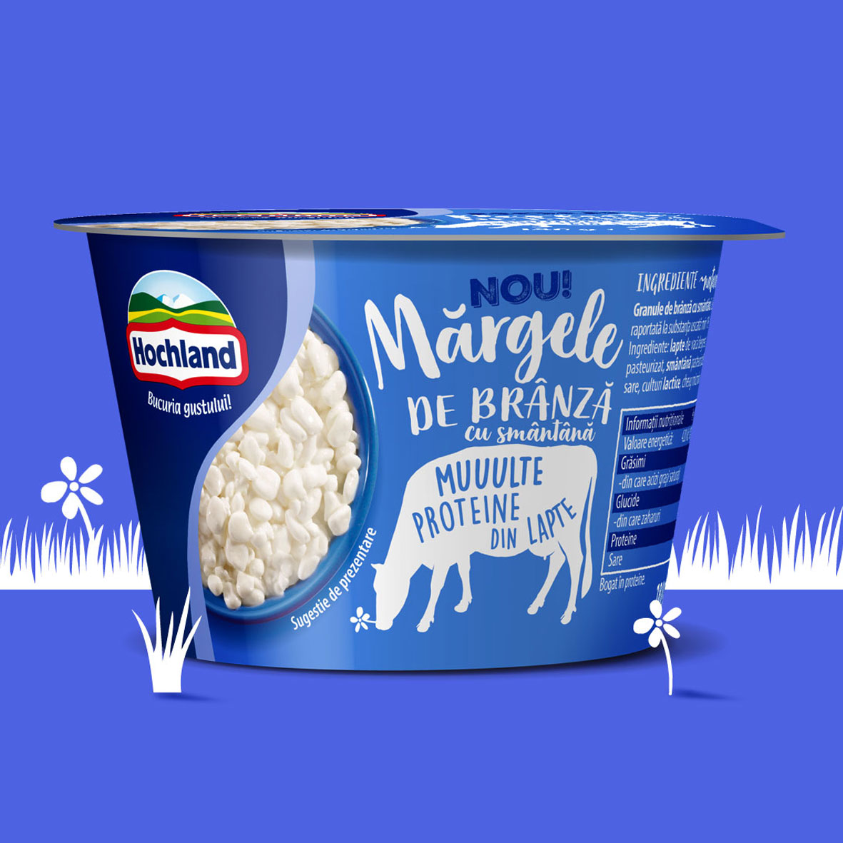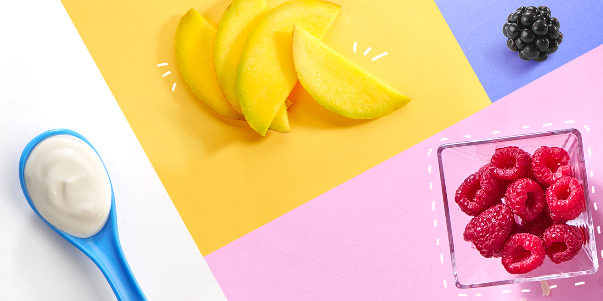
Fruit and yogurt. Only two ingredients, and we had hundreds of ideas to show them. The task seemed to seem simple. JogoMi, a fruit and yogurt dessert enclosed in a small tube, is a novelty in the BoboVita brand offer. The new product required a new packaging. The goals we set ourselves were: to be consistent with BoboVita branding, to present fruit and yogurt in an appetizing form, and to find colors that will make products stand out on the store shelf. JogoMi dessert packaging had to be adapted to the entire architecture of the BoboVita brand, but we wanted to improve the current way of showing fruit. Appetizing photos and presentation of yogurt on a spoon allowed us to build a clear message. The final effect was achieved gradually, but work on details brought the expected success. It is milky, fruity and delicious.
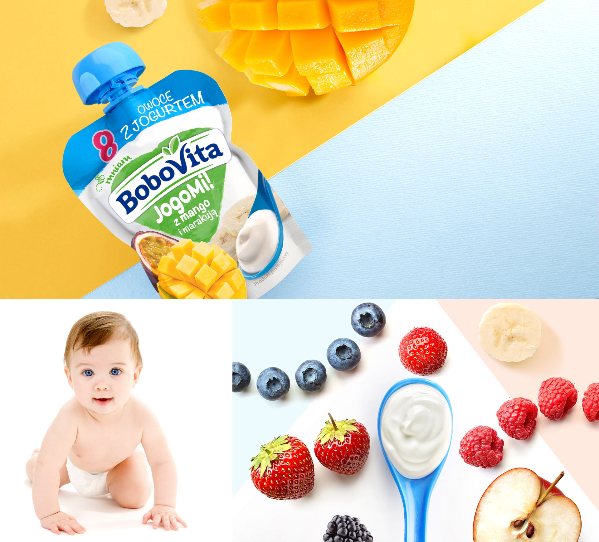
Designing packaging for children’s products has its own rules. JogoMi sachets were to arouse the interest of parents, but also to encourage the child to eat dessert. So colors played a very important role in the project. We have chosen white, although it is a color that may seem cool and distancing.
To avoid this impression, we have added a blue panel at the top of the sachets. As with other BoboVita products, the central place of packaging was taken by the logo, which we additionally supplemented with the name JogoMi.