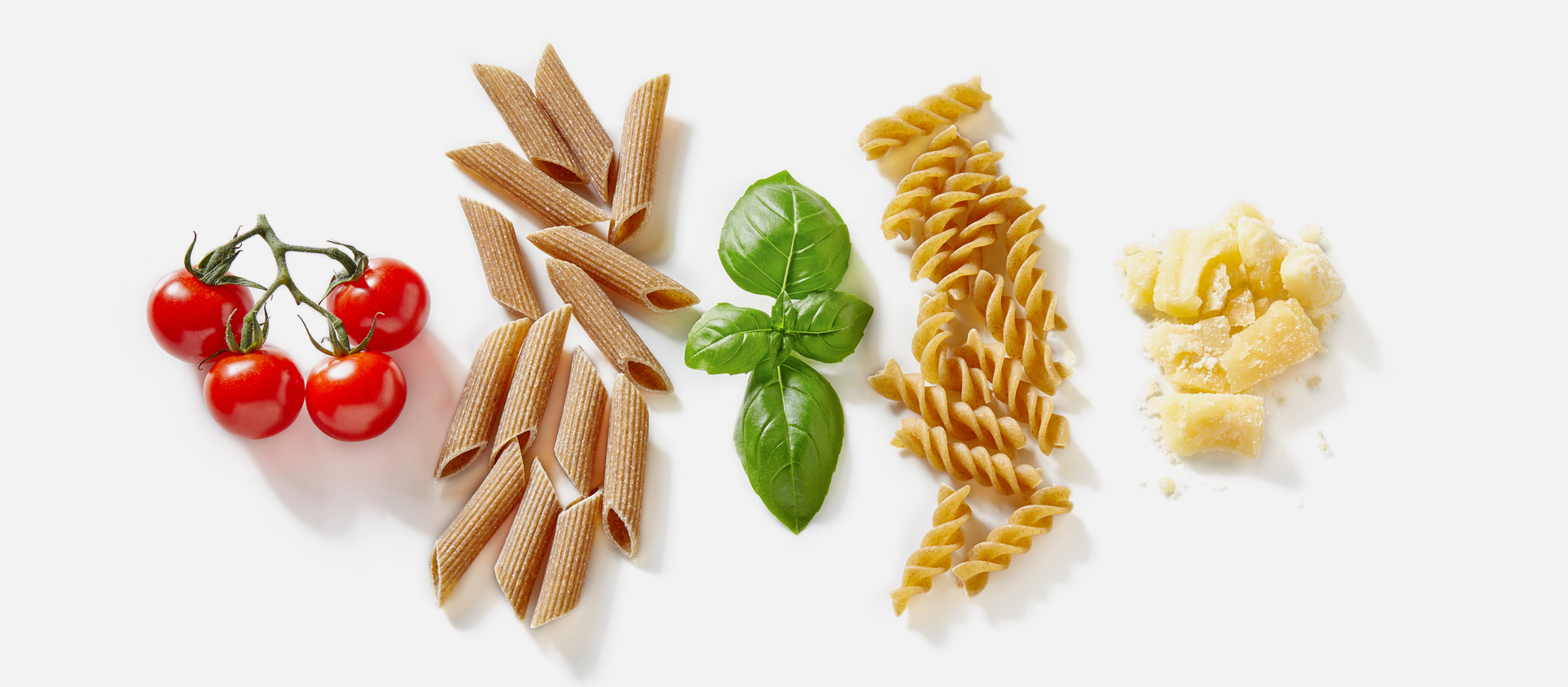
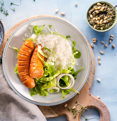
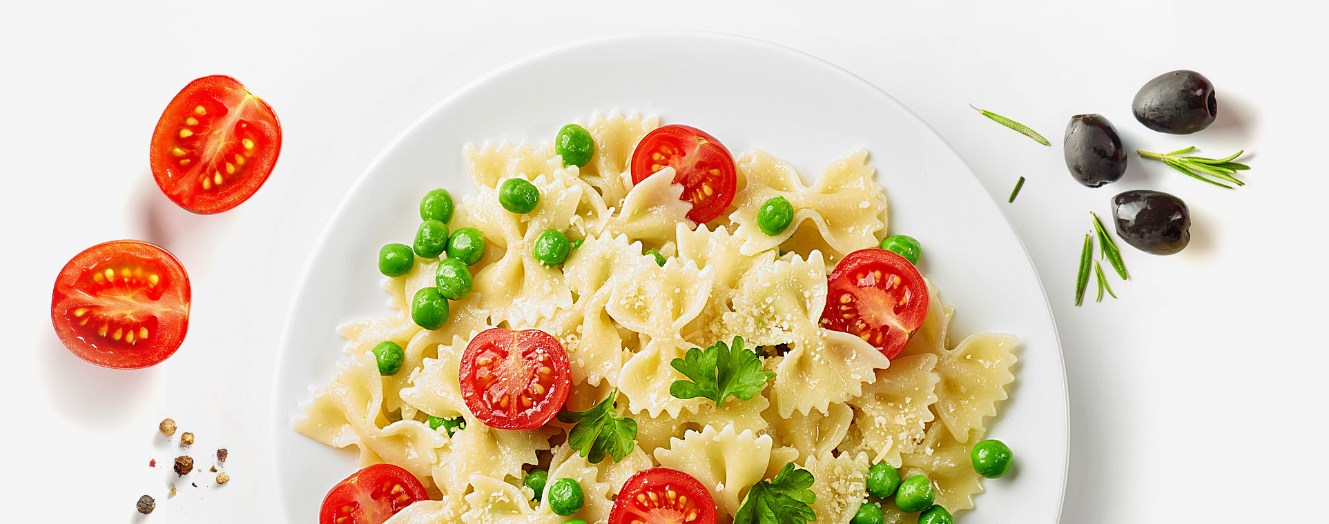
The Goliard brand is a producer of high-quality pasta that has been present on the market for 30 years. The basis of the offer are egg pastas, especially broth slices, which are loved by the heavy-users of products with an ear of grain. The product portfolio, however, is much broader and includes durum wheat flour, wholemeal, flavored pastas, tortellini and crispbread. For many years, the company has developed – increased distribution, sales, and expanded its portfolio, which unfortunately cannot be said about the visual identity that was created several dozen years ago. The time has come for holistic changes: bringing freshness and modernity, but still firmly based on what is most important to the brand: tradition, good ingredients and closeness. To the new pasta packaging design for Goliard!
The rebranding of Goliard had to be comprehensive and complete. This does not mean, however, that the brand was ready to break with the current image. On the contrary, the client wanted to strengthen Goliard – especially its shelf impact – but in such a way that users would not feel confused and could still reach their favorite products.
Introducing new branding solutions, rebuilding the brand architecture and changing the packaging design was supposed to happen in line with the new positioning of individual offers. The task thus posed required an in-depth analysis of the brand’s strategy, the values on which it is based and the existing visual identity system. This is how the transition process began.
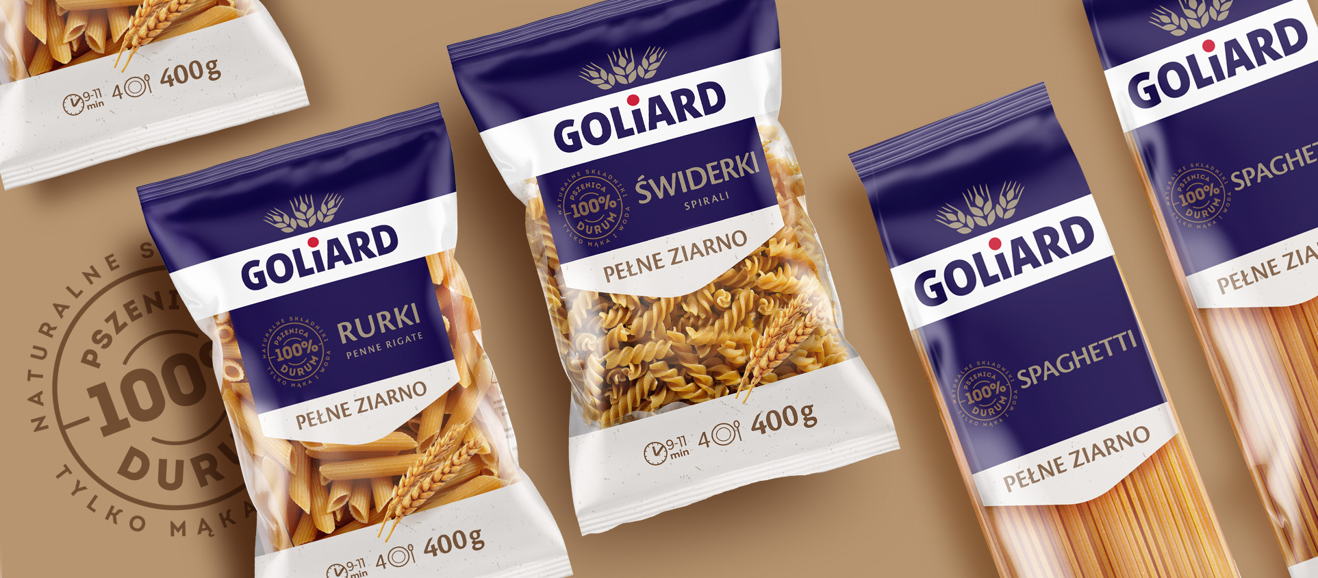
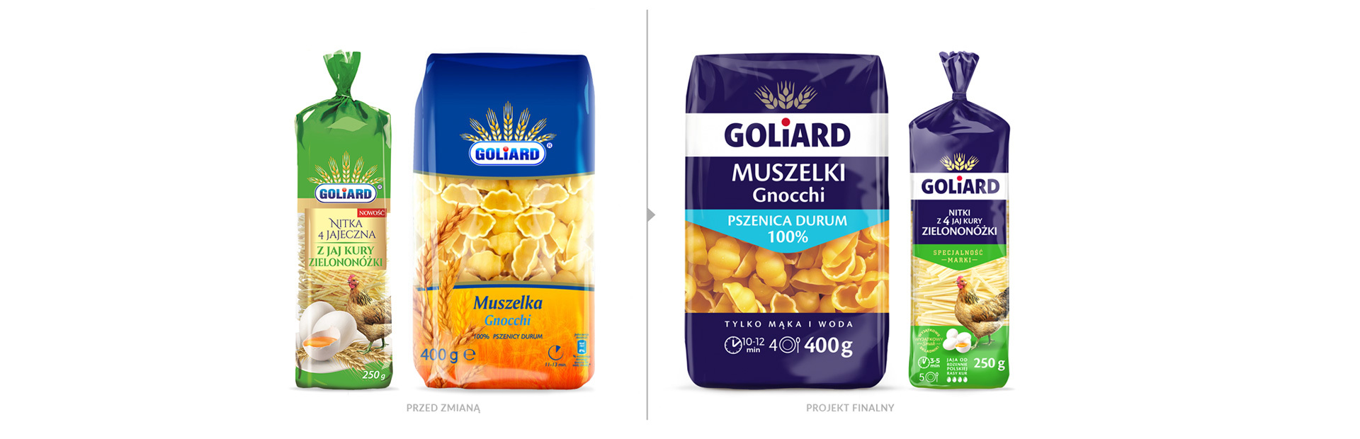
The new visual identity system has opened the door to changes. We made a metamorphosis of the logotype, which gained modern expression, while maintaining the brand’s character and its main visual distinguishable feature – the ears. We have also developed new colors and branding elements that would be used both in packaging and other contact areas with users.
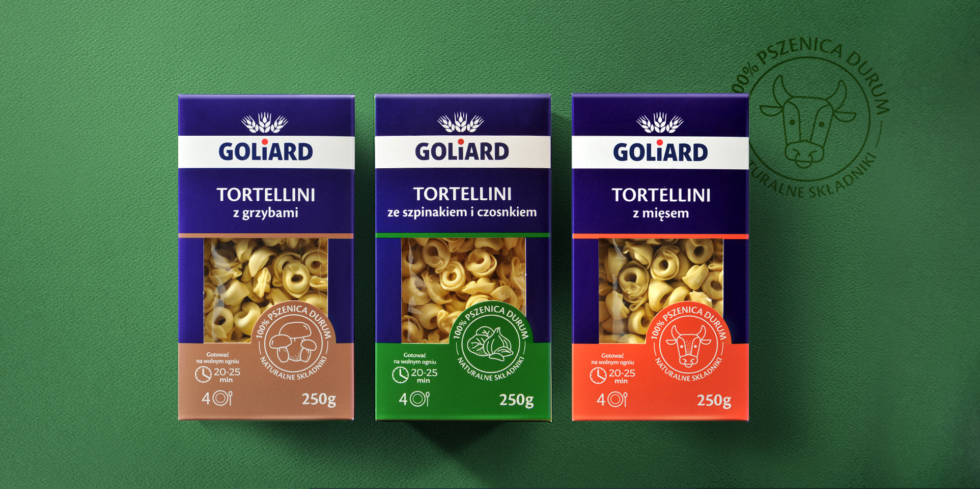
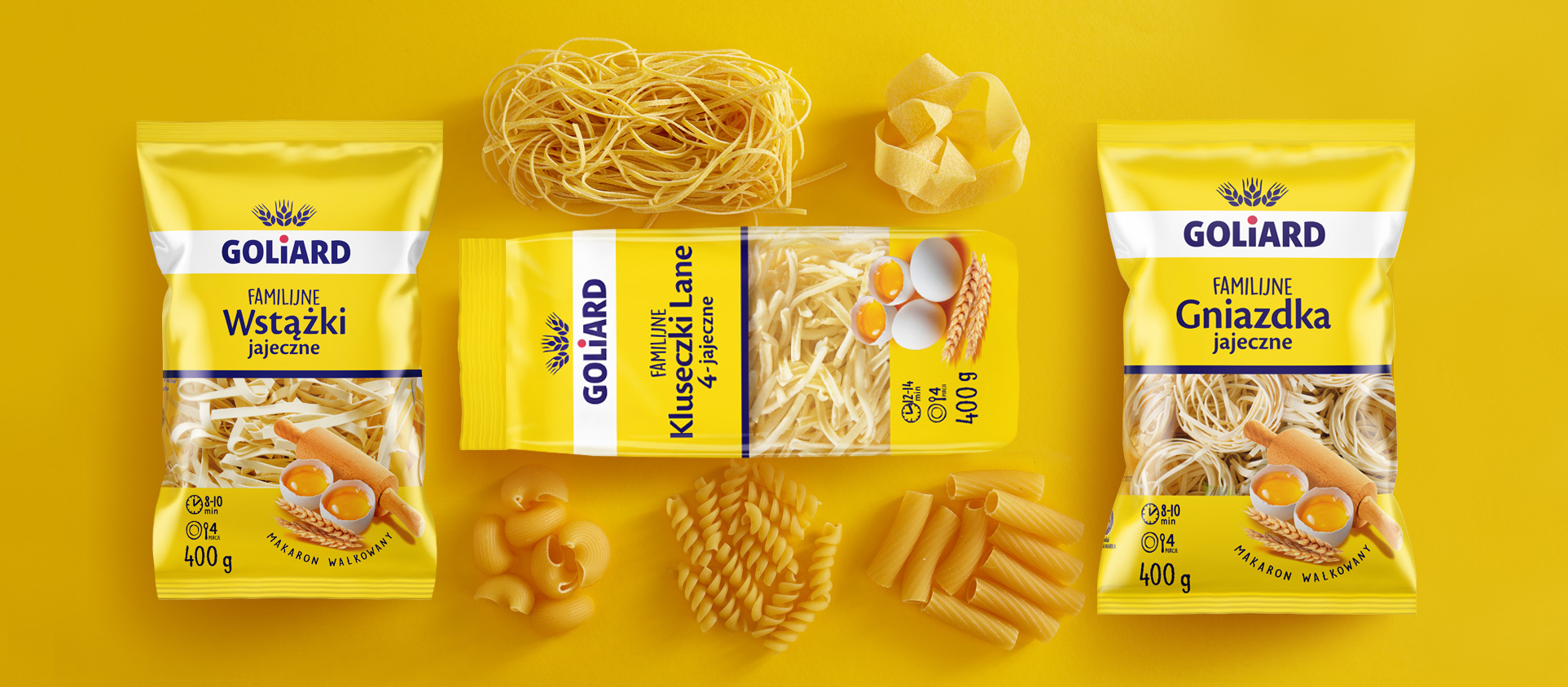
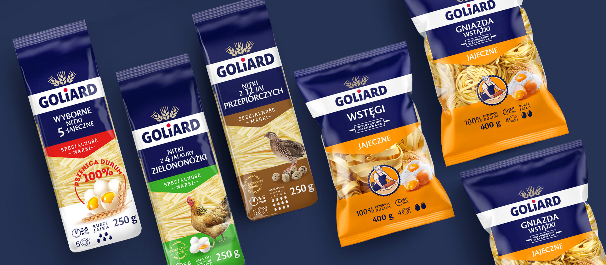
Work on the pasta packaging design took the next step. The packaging has completely changed: after redesigning the brand’s
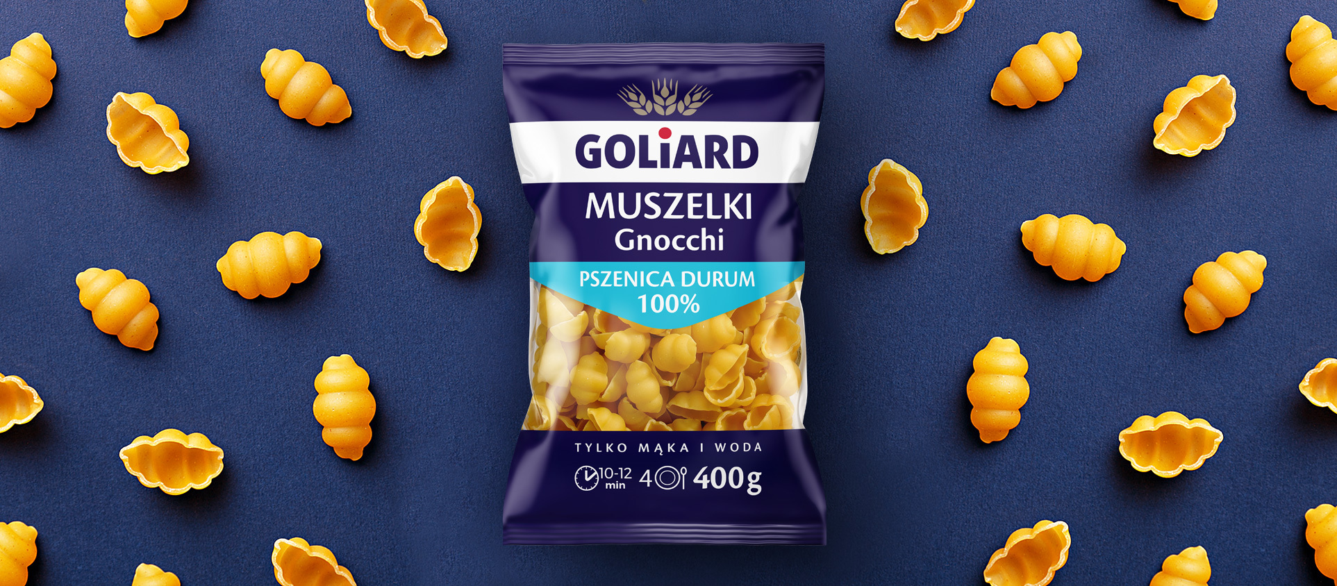
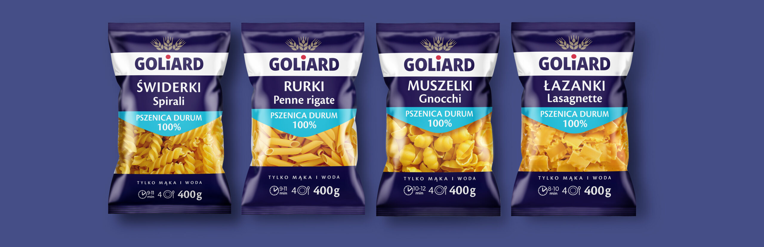
architecture, we transferred its main assumptions to branding, graphics and the communication solutions of packaging. The basic offer, positioned in the mainstream / upper mainstream segment, which includes special lines and a low-cost family packages, was distinguished. Colors and typography were selected for individual offers, and a system of icons and illustrations created to organize and facilitate the communication of benefits on the packaging.
The result – a strong hit from the shelf, easy navigation and a still warm, close brand image. In a word, a new opening for a well-known and liked brand.